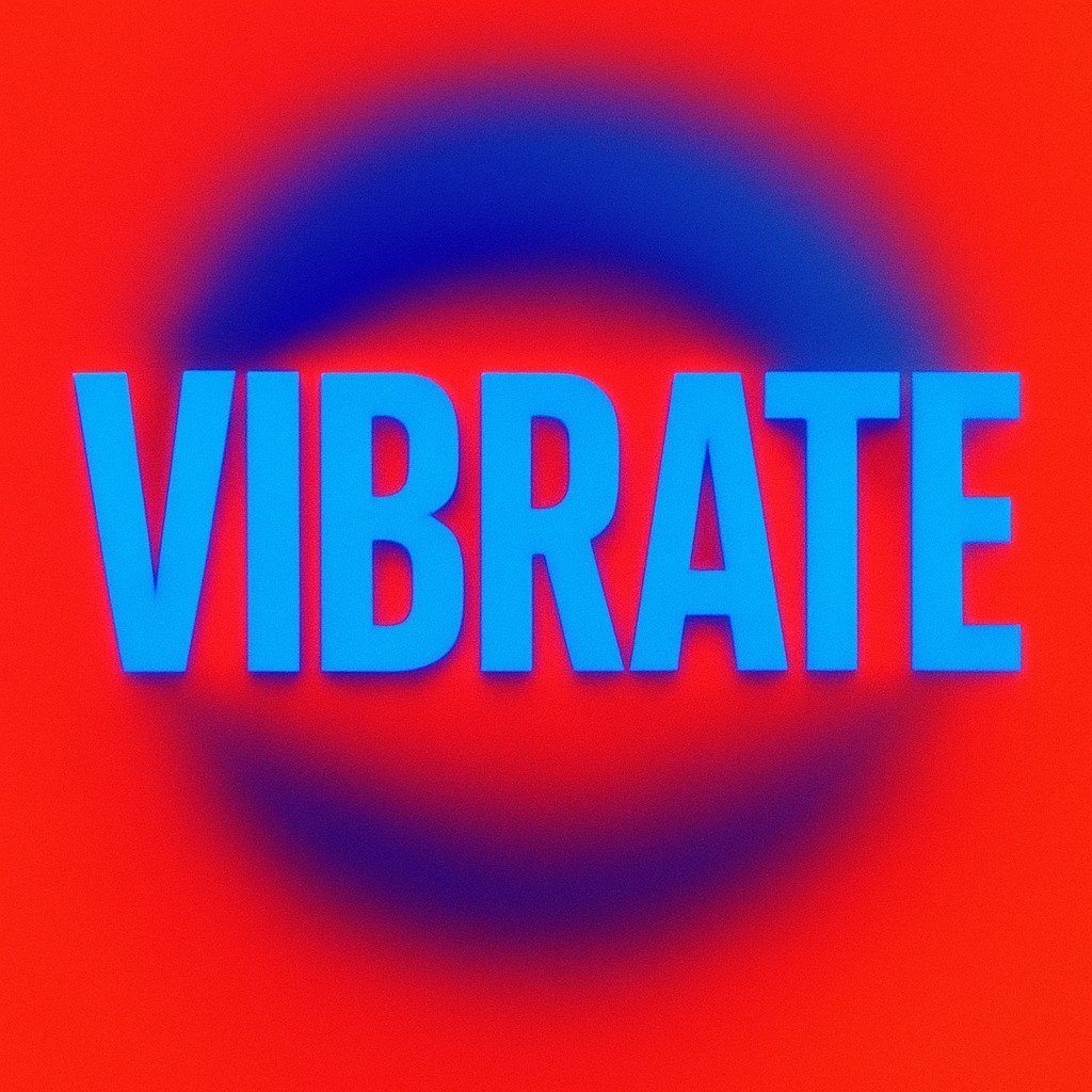
Imagine you are walking through a modern art gallery or scrolling through a neon-soaked corner of the internet. Suddenly, you see a graphic with electric blue text sitting on a searing red background. As you look at it, something strange happens. The red text seems to lift off the surface, hovering a few millimeters closer to your face, while the blue background sinks away into a deep, infinite pool. If you move your head slightly, the colors might even seem to "vibrate" against each other. This creates a jittery, restless energy that makes your eyes feel like they are working overtime just to keep the image still.
This isn’t a screen glitch or a magic trick involving 3D glasses. It is a fundamental quirk of how the human eye processes light, known as chromostereopsis. While we often think of our eyes as perfect cameras capturing a flat reality, they are actually biological optical instruments with specific physical limits. Because different colors of light travel in different wavelengths, our eyes struggle to focus on all of them at once. Your brain, a master of improvisation, interprets this mechanical struggle as a signal for depth. It creates a three-dimensional world out of a perfectly flat, two-dimensional surface.
The Lens as a Prismatic Gatekeeper
To understand why colors leap off the page, we have to look at the geometry of the eye. Think of the lens of your eye not as a single sheet of glass, but as a sophisticated living prism. When white light passes through a prism, it bends and separates into a rainbow because different wavelengths refract, or bend, at different angles. Short wavelengths, which we see as blue, bend more sharply than long wavelengths, which we see as red. This phenomenon is called chromatic aberration, and it is the main reason behind these 3D color illusions.
In a perfect optical system, all these colors would meet exactly on the retina, which is the light-sensitive "film" at the back of the eye. However, because the human eye is slightly "imperfect" by design, these colors rarely land on the same spot. When you look at a red object and a blue object that are the same distance away, the red light hits the retina at a slightly different horizontal position than the blue light. Our brains use "binocular disparity" - the slight difference between what our left and right eyes see - to calculate distance. This horizontal shift mimics the exact signals we get when looking at objects in a 3D space.
The result is a convincing, though sometimes dizzying, illusion. For most people, red appears to be in front while blue recedes into the background. This happens because red light focuses "behind" the retina. This forces the eye to adjust its shape to bring the image forward, a muscular effort usually reserved for looking at nearby objects. Conversely, blue light focuses in front of the retina. However, it is fascinating to note that this is not the same for everyone. A small percentage of people experience "reverse chromostereopsis," where blue appears closer than red. This is likely due to subtle differences in the placement of their pupils or the specific shape of their corneas.
The Mechanics of Color and Distance
The intensity of this effect depends heavily on how pure and bold the colors are. If you mix colors with a lot of white, like pastel pink and baby blue, the effect is muffled. This is because white light contains a wide range of wavelengths that "water down" the refraction error. However, when you use highly saturated, pure colors, the eye has no middle ground to rest on. The struggle becomes intense, and the perceived depth becomes much more obvious.
| Color Relationship |
Perceived Depth Response |
Typical Visual Sensation |
| Red on Blue |
High Disparity |
Red appears to "float" significantly above the blue. |
| Blue on Red |
High Disparity |
Blue appears to "sink" into a hole or recede deeply. |
| Green on Red |
Moderate Disparity |
Slight vibration; depth is less stable and may flicker. |
| Yellow on Black |
Low Disparity |
Very easy to read; no significant 3D shift or strain. |
| Pastel Tints |
Negligible |
Appears perfectly flat; easy for the eye to track. |
The table above shows why certain design choices feel so aggressive. When designers pair deep reds and blues, they are forcing your eye to perform a "depth dance" it wasn't expecting. This is especially noticeable in dark environments, like a dim room with a bright TV. In these settings, your pupils dilate, or open wider. This allows light to pass through the outer edges of the lens where the prismatic bending is even more extreme. This ramps up the depth effect, making the colors vibrate so intensely that some people find it physically uncomfortable or even nauseating to look at for long.
Artistic Mastery of Visual Tension
Long before we understood the physics of chromatic aberration, artists were using these principles to bring life to their work. You can see this in the stained-glass windows of medieval cathedrals. Master glassmakers often placed deep cobalt blues next to brilliant rubies. When sunlight poured through the glass, the windows didn't just look like flat pictures; they seemed to pulse with energy. The churchgoers didn't need to know about wavelengths to feel that the red figures were stepping out toward them from a heavenly blue void.
In the 20th century, the "Op Art" movement took this idea to the extreme. Artists like Victor Vasarely and Bridget Riley experimented with geometric patterns that used chromostereopsis to create the illusion of motion. By alternating slivers of high-contrast colors, they could make a still canvas appear to swirl, breathe, or ripple. They discovered that by manipulating the edges where two colors meet, they could confuse the brain's ability to detect borders. This is why a red line on a blue background often looks "fuzzy" or "glowing" at the edge; your brain is receiving conflicting data about exactly where that border sits in 3D space.
The abstract painter Mark Rothko also used this effect, though in a much more subtle way. His massive "color field" paintings often featured large blocks of hovering colors. By layering thin coats of red over blue or vice versa, he created a sense of atmospheric depth that drew the viewer in. He wasn't just painting a red square; he was creating a volume of space the viewer felt they could physically step into. It was a clever use of a biological limitation, turning a "flaw" of the human eye into a moving experience.
The High Cost of Visual Overload
While chromostereopsis is a gift to artists, it can be a nightmare for digital designers and engineers. In the early days of personal computing, it was common to see websites with bright blue text on a red background or neon green menus on blue. These designs are now strictly avoided in the professional world, and for good reason. The constant "vibration" caused by these color pairs leads to rapid eye fatigue.
Because your eye is constantly trying to re-focus to handle the different focal lengths of the colors, the tiny ciliary muscles - the muscles that shape your lens - never get a chance to relax. This leads to a condition called "asthenopia," more commonly known as eye strain. Symptoms include headaches, blurred vision, and a burning sensation in the eyes. For people who spend eight hours a day in front of a screen, a poorly designed color palette isn't just an ugly choice; it is a genuine health hazard.
Modern design systems now prioritize brightness contrast over color contrast. This means they focus on the difference in "lightness" between two colors rather than where they sit on the color wheel. If you turn a well-designed interface to black-and-white, you should still be able to read everything clearly. If the interface relies on the 3D depth effect to show what is important, it will likely fail this "squint test" and leave users with a headache. This is why most "dark modes" use soft grays and muted blues rather than neon colors, ensuring the screen remains easy on the eyes even in low light.
Correcting the Myths of the Floating Image
There are several common misconceptions about this effect that often blur the line between science and urban legend. One myth is that this only happens on digital screens. In reality, chromostereopsis is a physical property of light and lenses. It happens just as easily with oil paints, printed posters, or neon signs on a rainy street. The screen only makes it more obvious because the light is shining directly into your eye rather than reflecting off a surface.
Another misconception is that everyone sees the effect the same way. As mentioned earlier, our perception of this depth is very individual. Factors such as the distance between your pupils, whether you wear glasses, and even the age of your eyes play a role. As we age, the lenses in our eyes naturally turn yellow and become less flexible, which can actually decrease the intensity of the effect. If you find that the "vibrating red" isn't as intense as it used to be, it might just be a sign that your eyes are maturing and filtering out those extreme wavelengths more efficiently.
Finally, some people believe that "color blindness" eliminates this effect. This is actually false. Even if someone cannot tell the difference between red and green, the physical wavelengths of the light still enter the eye and bend at different angles. The eye still struggles to focus them on the same spot, even if the brain doesn't label the colors as "red" or "green." The depth illusion is a result of the eye's physical hardware, not just the brain's color-processing software.
Embracing the Complexity of Human Vision
Understanding chromostereopsis changes the way you look at the world. Once you are aware of how colors manipulate your sense of space, you start to see it everywhere. You catch it in the flicker of holiday lights, where the blue bulbs seem to hide in the needles of the tree while the red ones leap toward you. You notice it in the "glowing" edges of a sunset where deep purple clouds meet the orange horizon. It is a constant reminder that our view of reality is a delicate construction, built from biological compromises and clever mental shortcuts.
This phenomenon teaches us that "limitations" are often the source of our most interesting experiences. If our eyes were perfect, clinical lenses, we would live in a world of flat precision. Instead, we live in a world where colors dance, where depth is pulled out of thin air, and where a simple choice of paint can make a person feel like they are falling into the sky. By acknowledging the quirks of our biology, we can design better tools, create more moving art, and appreciate the strange, vibrant theater that happens every time we open our eyes.
The next time you see a sign or a screen that seems to vibrate with an impossible energy, don't just look away. Take a moment to appreciate the sophisticated machinery at work inside your own head. You are witnessing your brain trying to solve a puzzle that physics has set for it, and the "mistake" it makes is what we call beauty. The world isn't just what is there; it is a blend of what exists and how we are built to see it. Stay curious about these visual glitches, for they are the windows into how we truly navigate the multi-layered tapestry of our lives.