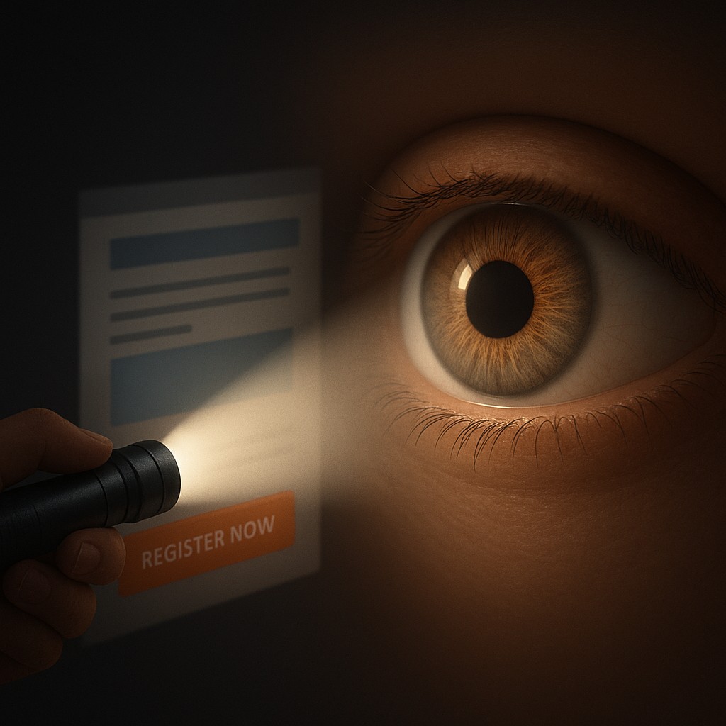
Imagine you are standing in a dark room with a small, powerful penlight. As you sweep the beam across the walls, you can only see a small circular patch of detail at any given moment. This is exactly how your brain perceives the digital world. While you might feel like you are taking in an entire website or document at once, your eyes are actually darting around, stitching together a patchwork of high-resolution memories. The center of your vision, a tiny pit in the retina called the fovea, is the only place where you can actually see sharp detail. Everything else in your peripheral vision is a blurry, low-resolution soup of shadows and hints.
Designers are the masters of this penlight. They know that you are essentially "blind" to 99 percent of the screen at any specific micro-second. Because your foveal vision only covers about two degrees of your visual field, roughly the width of your thumbnail at arm’s length, the designer’s job is to trick your brain into moving that penlight exactly where they want it. Through a combination of biology and artistic flair, they create a visual hierarchy. This is the invisible hand that pulls your gaze from a headline to a photo, and finally to that bright orange "Register Now" button, often before you have even consciously decided what you are looking for.
The Biology of the Peripheral Blur
To understand why a giant bold font works, we have to look at the anatomy of the human eye. The fovea is packed with cone cells, which are responsible for color and sharp detail. However, as you move away from that center point, the density of these cells drops off. In your peripheral vision, you are great at detecting motion or high-contrast shifts, but you couldn't read a single word of text to save your life. This creates a massive bandwidth problem for the brain. It simply cannot process the millions of pixels on a modern laptop screen in high definition all at once.
This biological limitation is why "more" is almost always "less" in design. If a screen is cluttered with twenty different bright icons and ten different fonts, your fovea has no idea where to land. This creates a sensation of cognitive friction, that annoying feeling where you look at a page and your brain says, "I don't want to deal with this." By understanding that the eye is constantly searching for a place to rest, designers use "anchors." An anchor is a high-contrast or large element that acts as a safe harbor for the fovea. Once the eye lands on an anchor, the designer can then lead it down a path toward secondary and tertiary information.
Engineering the Eye’s Path Through Contrast
The most powerful tool in the designer's kit for moving the fovea is contrast. This isn't just about black versus white; it is about any visual difference that screams for attention. When an object stands out from its surroundings, it triggers a "preattentive" response. This means your brain processes the object before you are even aware of it. It’s a survival mechanism. If a red apple is hanging in a sea of green leaves, your ancestors needed to see it instantly. In the modern world, if a "Submit" button is bright blue against a light gray background, your brain finds it before you finish reading the form.
| Visual Tool |
Biological Trigger |
Functional Result |
| Scale and Size |
Foveal Priority |
Larger items suggest importance and command immediate focus. |
| Color Saturation |
Preattentive Processing |
Bright colors break through the "noise" of peripheral blur. |
| Proximity |
Gestalt Grouping |
Items placed close together are processed as a single logical unit. |
| Negative Space |
Reducing Neural Noise |
Empty space prevents the fovea from being overwhelmed by data. |
Beyond just color, scale plays a massive role in setting the tone. Our brains are hardwired to assume that bigger equals more important. When you open a news app, the headline isn't just at the top; it's five times larger than the body text. This creates a clear starting point for the fovea. If every sentence on the page was the same size, your eyes would wander aimlessly, and you would likely close the tab in frustration. By varying the size of elements, the designer creates a visual journey, allowing you to skim the big ideas first and dive into the small details only when you choose to focus your penlight there.
The Secret Language of Proximity and Grouping
While contrast tells the eye where to look first, proximity tells the brain how to categorize what it sees. This relies on "Gestalt" principles, a psychological theory that suggests humans naturally perceive patterns rather than individual dots. If three buttons are grouped closely together in the top right corner of an app, your brain immediately labels them as a "menu." You don't have to look at each one individually to understand their purpose until you are ready to interact with them. This "chunking" of information is a clever way to bypass the limits of our central vision.
When things are spread out randomly, the fovea has to do a lot of heavy lifting. It has to jump from one side of the screen to the other, a movement called a saccade. Saccades are exhausting for the brain if they happen too frequently and without a clear pattern. A well-designed interface minimizes unnecessary jumps by placing related information exactly where the eye expects it to be. For example, a picture of a product and its price should always be close together. If the price is in the bottom left and the photo is in the top right, the brain has to work twice as hard to connect the two, leading to a higher "bounce rate" where the user simply gives up.
Debunking the Myth of the Busy Screen
A common misconception among non-designers is that filling every inch of "white space" with information makes a document more useful. The logic seems sound: if the user has more information, they can make better decisions. In reality, the opposite is true. This is often called "the paradox of choice" applied to vision. When you fill every gap with a banner, a sidebar, or an extra paragraph, you are creating visual noise. This noise confuses the fovea, making it harder for the eye to find the path the designer intended.
White space, or negative space, is not "empty" space. It is a functional tool that acts like the silence between notes in a song. It provides a buffer that prevents different visual elements from bleeding into each other. Think of it as a cooling system for your mental workload. By leaving areas of the screen blank, you allow the viewer's eye to rest and refocus. High-end luxury brands often use massive amounts of white space to signal confidence and clarity, while "discount" websites often cram every corner with flashing text, which signals chaos and urgency. Understanding this allows you to organize your own reports or slideshows with the realization that giving your content room to breathe actually makes it stand out more.
Guiding the Gaze in the Age of Distraction
In our modern "attention economy," companies are in a constant race to capture your focus. Social media feeds are masterclasses in visual hierarchy. Notice how the "Like" and "Share" icons are often just a bit more colorful or distinct than the timestamp of the post. Notice how the "Add to Cart" button on a shopping site stays in a fixed position even as you scroll. These aren't accidents; they are calculated attempts to ensure that even when your vision is wandering, it eventually gets caught in a "visual trap" designed to trigger an action.
By learning these principles, you gain a bit of digital self-defense. You can start to see why certain apps are more addictive than others and why some documents are a joy to read while others feel like a chore. You can apply these lessons to your own life, whether you are building a resume, designing a presentation for a client, or just trying to organize your desktop. Remember that the human eye is a specialized tool with very specific limits. If you respect those limits by using size, color, and space intentionally, you stop being a victim of visual noise and start becoming a master of information.
The next time you look at a screen, try to be aware of your own "penlight." Notice where your eye lands first and ask yourself what drew it there. Was it a splash of red? A giant word? A lonely icon surrounded by white space? Once you see the invisible scaffolding of design, the world starts to look a lot more coordinated and a lot less overwhelming. You have the power to direct attention, provided you remember that the most important part of seeing is knowing exactly what to ignore. Harness the constraints of your biology, and you will find that a little bit of focus goes a long way in a world that never stops shouting.