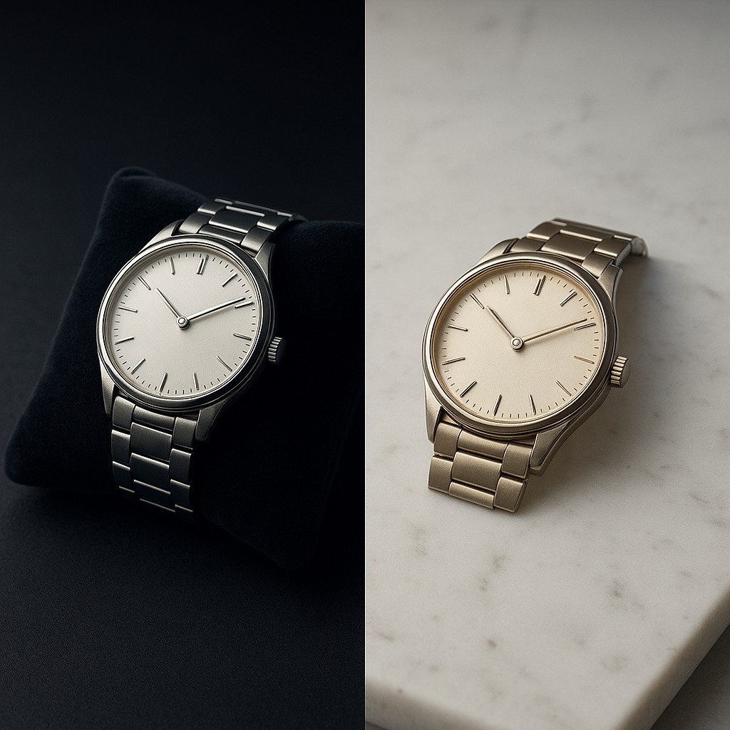
Imagine you are standing in a high-end jewelry store, looking at a modest silver watch resting on a deep charcoal velvet cushion. The silver looks brilliant, almost glowing with a crisp, bright white light. Now, imagine that same watch placed on a stark, bleached white marble counter. Suddenly, the metal appears duller, perhaps even slightly dirty or yellowish. You might assume the lighting has changed or that your eyes are playing tricks on you, but the physical properties of the watch are exactly the same. What you are experiencing is not a failure of your vision, but a highly sophisticated feature of your brain’s processing power.
This phenomenon is known as simultaneous contrast. It proves that our eyes are not objective light meters, but rather storytellers that focus on relationships. We do not see color in a vacuum; instead, our brains are constantly making a deal between an object and its surroundings. This psychological and physical mechanism ensures that we don't just see "red" or "blue," but rather how those colors behave in their specific neighborhood. By understanding how this works, we can pull back the curtain on how our bodies build our reality. We can then learn to manage visual environments with the precision of a master painter or a professional designer.
The Biological Urge to Find Edges
To understand why the brain insists on distorting the truth about color, we have to look at our evolutionary history. In nature, survival rarely depends on knowing the exact shade of a predator's fur. Instead, survival depends on seeing where the lion ends and the tall grass begins. This is called edge detection. Our visual system is hard-wired to exaggerate the differences between objects that touch each other to make shapes more distinct. When two colors are placed side by side, the brain essentially "pushes" them away from each other in our minds, making the darks look darker and the lights look lighter right where they meet.
This process is fueled by a neurological quirk called lateral inhibition. When a light-sensitive cell in your eye is stimulated, it doesn't just send a signal to the brain saying it sees light; it also sends a "hush" signal to its immediate neighbors. This suppression creates a sharpened boundary. If you place a medium-grey square on a black background, the grey cells are not being suppressed very much because their neighbors (the black area) are relatively quiet. However, if you move that same grey square to a brilliant white background, the surrounding white cells are screaming with activity. These cells suppress the signal from the grey square, making it look much darker and more sunken than it actually is.
The Tug-of-War of Opposite Colors
Simultaneous contrast does not just affect how bright or dark something looks; it fundamentally changes the color itself. The most dramatic shifts happen when we deal with complementary colors, which are opposites on the color wheel like red and green or blue and orange. Your brain has a strange habit: when it sees a large amount of one color, it starts to crave the opposite. If you stare at a bright yellow wall for long enough and then look at a neutral grey spot, that spot will seem to glow with a ghostly violet tint. This is because your brain is trying to "balance" what you see by projecting the opposite of the main color onto everything else.
This means that a neutral color is never truly neutral; it is a chameleon that absorbs the "vibe" of its surroundings. Designers use this to their advantage when they want to make a color pop without actually changing the color of the object itself. If you have a purple logo that feels a bit dull, you don't necessarily need a more vibrant purple. You might just need a yellow background. The yellow will "push" the purple to look more intense because the brain is already searching for violet tones to balance out the yellow environment. This is why a simple grey sweater can look "cool" and bluish when worn with tan pants, but "warm" and brownish when paired with a navy blazer.
A Quick Guide to Visual Interaction
Because these shifts are predictable, we can categorize how different backgrounds will influence an object. The general rule is that a background will project its own "opposite" onto the object sitting on top of it. If the background is very vivid, the object will look duller. If the background is very dark, the object will look lighter. This creates a fascinating set of rules that artists have used for centuries to create depth and light where none physically exists on the canvas.
| Background Style |
Effect on the Subject |
Practical Design Use |
| Dark or Black |
Subject looks lighter and larger |
Best for high-end jewelry or luxury tech ads |
| Light or White |
Subject looks darker and smaller |
Use to make text look crisp and grounded |
| Vivid, Bold Color |
Subject looks muted or greyish |
Avoid for bold products; use for subtle elegance |
| Opposite Color |
Subject looks more vivid and intense |
Best for "click here" buttons or highlights |
| Similar Color |
Subject looks like it is sinking or disappearing |
Use for subtle textures or background patterns |
The Master’s Secret for Creating Light
In the 19th century, a French chemist named Michel Eugène Chevreul noticed that weavers at a famous tapestry factory were complaining about the quality of their dyes. They claimed the black yarn was "weak" and looked greenish. Chevreul investigated and realized the dyes were perfect; the problem was that the black yarn was being woven next to blue yarn. Because the opposite of blue is a yellowish-orange, the brain was projecting a yellow tint onto the black, making it look sickly and faded. Chevreul’s work eventually led to his "Law of Simultaneous Contrast," which became the guide for famous painters like Georges Seurat.
Seurat and his peers realized that if they wanted to paint a truly brilliant orange sunset, they shouldn't just use the brightest orange paint. Instead, they should place small dots of blue or violet right next to the orange. By forcing the viewer's brain to do the work of "mixing" the contrast, they created a shimmer that felt more like real light than flat paint ever could. This is the difference between a drawing that looks "colored in" and a masterpiece that feels like it is radiating its own energy. The artists weren't just painting objects; they were painting the way our brains react to light.
Correcting the Myth of Objective Vision
One of the greatest misconceptions we have is that our eyes function like cameras, capturing a perfect record of the world. In reality, our vision is much more like an editor, constantly tweaking the "levels" of our surroundings to help us get around. A common myth is that if you want a color to look "more like itself," you should put it on a background of that same color. In fact, the opposite is true. If you put a bright red apple on a red tablecloth, the apple will look muddy and lose its "redness" because there is no contrast to define its intensity.
Another common error happens in interior design or app design. People often pick a "perfect grey" paint for their walls based on a tiny sample in the store, only to get it home and realize it looks like baby blue. This isn't usually because the lighting is different, though that plays a part. It is because the store's walls were likely a warm, creamy white, which pushed the grey toward the cool, blue end of the spectrum. When you get that same "blue-grey" paint into a room with wooden floors - which have orange tones - the blue effect is ten times stronger. You aren't seeing the paint; you are seeing the paint's relationship with your floor.
Mastering the Environment Over the Object
The big lesson from simultaneous contrast is that if you want to change how something looks, you don't always have to change the thing itself. This is a powerful metaphor for many parts of life, but in the world of design, it is a precision tool. If text on a website is hard to read, the solution isn't always to make it bolder or bigger; sometimes the solution is to slightly shift the background color to create a better contrast. By changing the environment, you control what the viewer sees without them ever realizing you’ve touched the controls.
This concept invites us to look at the world with a bit more skepticism and a lot more wonder. We are constantly moving through a sea of shifting colors that are being recalculated by our brain cells every millisecond. When you see a sunset that looks particularly purple, or a city street that feels unusually gritty and grey, take a moment to look at the surrounding colors. You might find that the "vibe" you are experiencing is a clever trick of the light, a biological illusion designed to help you see edges, while unintentionally making the world a much more vibrant place.
As you finish this exploration, try a small experiment in your daily life. Look at the icons on your phone or the clothes in your closet and see how their "personality" changes based on what is next to them. Notice how a neon green shirt makes your skin look a bit more flushed, or how a dark blue tie makes a white shirt look blindingly clean. Once you see the invisible threads of simultaneous contrast, you can never go back to seeing colors in isolation. You are no longer just a passive observer; you are part of the process of building your own visual reality, knowing that context is not just part of the story - it is the story.