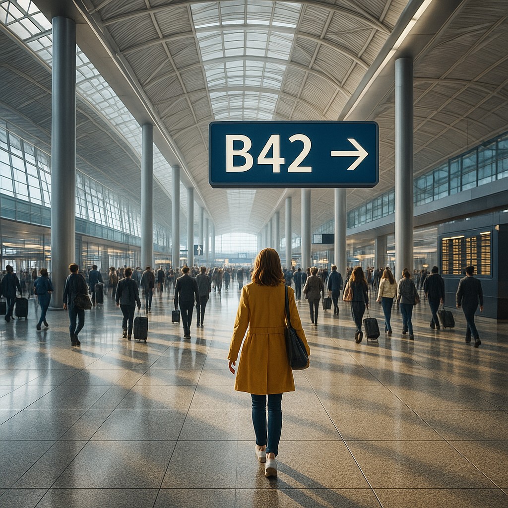
Imagine you are standing in the middle of a massive, modern international airport. The ceiling stretches toward the sky, the floor is a polished sea of granite, and thousands of travelers rush in every direction like atoms in a heated gas. You have twenty minutes to find Gate B42, and you have never been to this city before. In a poorly designed space, your stress levels would spike, your eyes would dart frantically in search of a tiny plastic sign, and you might eventually have to ask a busy janitor for help. However, in a well-designed space, you find yourself walking toward your destination almost by instinct, rarely needing to break your stride to check a map.
This invisible hand guiding you through the maze is known as wayfinding. While many people think wayfinding is just a fancy word for "putting up signs," it is actually a deep blend of psychology, biology, and engineering. It is the art of making a building "legible" so that the architecture itself tells you where to go. By tapping into basic human behaviors, such as our tendency to move toward light or our sensitivity to changes in floor texture, architects can make navigation feel effortless. This allows us to move through complex hubs like hospitals and transit centers with a sense of calm and confidence, even when we are in a hurry.
The Biological Compass and the Pull of the Light
To understand how wayfinding works, we first have to look at the animal instincts tucked inside the human brain. We are biological creatures with evolutionary hard-wiring that influences how we perceive space. One of the most powerful tools in an architect's kit is phototaxis, which is the natural tendency of living organisms to move toward a light source. Just as a moth is drawn to a porch light, humans are subconsciously pulled toward brighter areas. In a large building, a designer might place a soaring glass atrium or a wash of bright LED light at the end of a long, dim hallway to act as a "magnet," pulling people toward an exit or a main lobby without needing a single "EXIT" sign.
This use of light does more than just show the path; it creates a visual hierarchy. When everything is lit at the same intensity, the eye has nowhere to rest and the brain becomes overwhelmed by too much visual data. By manipulating shadows and highlights, architects can create "nodes" or landmarks. A brightly lit reception desk in a shadowy hospital lobby becomes an immediate focal point, signaling to the visitor that this is the place to start. This reduces "search time," which is the period when a person feels lost and anxious, by providing a clear, intuitive target.
Mapping the World Through Texture and Color
While light pulls us forward, the ground beneath our feet provides the building's "software," telling us about the zones we are entering. Scientists have found that humans are remarkably sensitive to changes in floor material, even when we aren't looking down. In wayfinding design, a shift from hard, echoing tile to soft, plush carpeting often signals a move from a public hallway to a private waiting area. In a sprawling medical center, these tactile cues help patients realize they have arrived at a specific department before they even see the room numbers.
Color works alongside these textures to provide a mental shorthand for complex layouts. This is more than just painting a wall red and calling it the Heart Center. High-performance wayfinding uses color as a consistent system that follows the traveler. If the "blue" path leads to the x-ray wing, that blue might appear in the floor stripes, the chair fabric, and even the tint of the glass partitions. Over time, the visitor stops looking at signs and starts looking for the blue "vibe." This creates a sense of spatial literacy, where the visitor feels they "speak the language" of the building.
The Science of Spatial Decision Points
In any journey from Point A to Point B, there are specific moments where the path splits, known in the industry as "decision points." These are the crossroads of the architectural world. A major failure in wayfinding occurs when a decision point is confusing, forcing a person to stop, spin around, and re-orient themselves. Effective design anticipates these moments of doubt. Architects design these junctions to be open and visible, often using "lines of sight" to show the traveler the next destination before they even reach the intersection.
Consider the difference between a narrow hallway that ends in a T-junction and an open plaza where three hallways meet. In the plaza, you can see the light from the windows of the next wing or a distinctive sculpture near the elevators. This visual connection allows the brain to plan the next move in advance. When we can see our destination, or at least the next landmark, the brain releases a small amount of dopamine, rewarding us for successful navigation and keeping stress levels low. This "progressive disclosure" of information ensures that the traveler is never overwhelmed by too many choices at once.
When Signs Fail and Logic Prevails
The most common mistake about wayfinding is thinking it is the same thing as signage. In reality, if a building requires too many signs to work, the architectural design has likely failed. Signs are often "band-aids" for confusing layouts. Consider a building designed like a labyrinth; no matter how many arrows you tape to the walls, the visitor will still feel uneasy because the shape of the space contradicts their internal logic. True wayfinding is holistic, meaning the shape of the rooms, the placement of the stairs, and the flow of the hallways must make sense on their own.
Signs should serve as the "final confirmation" rather than the "primary instructor." When you approach a set of elevators because the ceiling height and the floor pattern suggested they were there, a small, elegant sign confirming "Elevators" provides a satisfying "I knew it!" moment. This builds the user's confidence. However, when signs are the only thing guiding a person, they become "sign-bound," staring at text rather than observing their environment. This is less efficient and less safe, as people staring at overhead placards are less aware of their surroundings or potential hazards.
Comparing Traditional Navigation vs. Wayfinding Design
To better understand the shift from old-school signs to modern wayfinding, let's look at how different elements function in each approach.
| Feature |
Traditional Navigation |
Intentional Wayfinding Design |
| Primary Tool |
Text-heavy signs and arrows |
Environmental cues (light, color, shape) |
| User State |
Active searching and mental effort |
Subconscious drifting and intuitive flow |
| Orientation |
"Where am I on this map?" |
"I naturally follow the light and color." |
| Mental Load |
High; requires reading and interpreting |
Low; relies on biological instincts |
| Aestethics |
Cluttered with placards and tape |
Clean, integrated building features |
| Reliability |
Fails if signs are blocked or small |
Succeeds through the logic of the space |
The Psychological Weight of Feeling Lost
The impact of wayfinding goes far beyond simple convenience; it has a profound effect on our mental health and physical wellbeing. In environments like hospitals, where visitors are often under extreme emotional stress, the ability to find a loved one's room without getting lost is a matter of basic dignity. Research in environmental psychology shows that "wayfinding distress" can lead to increased heart rate, frustration, and even a weaker immune response. When a space is designed to be intuitive, it acts as a "silent host," welcoming the visitor and reducing their anxiety.
In commercial settings, such as shopping malls or luxury hotels, wayfinding is a tool for "spatial branding." A hotel that guides you seamlessly from the valet to your room without you ever feeling confused projects an image of competence and care. You walk away feeling that the experience was "smooth," even if you can't quite pinpoint why. That smoothness is the result of thousands of tiny design choices, from the way the elevator buttons light up to the specific angle of a hallway that gently nudges you toward the lobby.
Designing for the Universal Human Experience
Finally, we must consider that wayfinding is not a "one size fits all" solution. A truly legible building must be easy to navigate for everyone, including the elderly, children, and people with disabilities. For someone with visual impairments, wayfinding shifts from sight to touch and sound. Textured "warning strips" on the floor near stairs or specific sounds in different rooms (like the hum of a fountain in a courtyard) become the primary cues.
For the elderly, especially those dealing with memory loss, wayfinding cues need to be even more distinct. Using recognizable landmarks, like a specific piece of art or a unique furniture cluster at every floor's elevator bank, provides an "anchor" for memory. These anchors help people orient themselves in time and space, preventing the disorientation that often leads to falls or distress. By designing for the most vulnerable users, architects create spaces that are more intuitive and comfortable for everyone.
As you step back out into the world, start looking for these invisible instructions. Notice how the floor changes when you enter a store, or how your eyes are naturally drawn to the brightest part of a room. You will begin to see that the world is not just a collection of walls and doors, but a giant, silent conversation between you and the designers of your environment. Understanding wayfinding allows you to appreciate the hidden logic of the modern world, turning every trip through a new building into a masterclass in human psychology. You are never truly lost when you know how to read the language of the space around you.