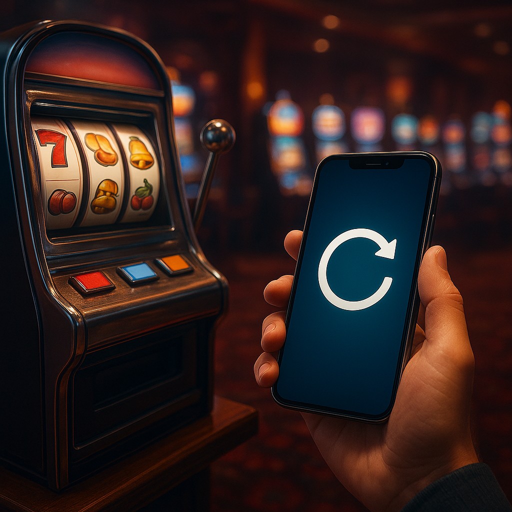
Imagine for a moment that you are standing in a dimly lit, plushly carpeted Las Vegas casino. To your left, a row of slot machines chirps and glows, tempting passersby with the promise of a life-changing jackpot. You watch a player reach out, grab a silver handle, and pull it down with a sharp, mechanical tug. There is a suspended moment of pure, anxious potential as the reels spin. Then, the images click into place. Sometimes it is a loss, sometimes a small win, but the brain is most active during that specific gap between the pull and the result. This isn't just a story about gambling; it is a story about the phone currently sitting in your pocket or hand.
Every time you open a social media app and drag your thumb from the top of the screen toward the bottom, you are performing a digital version of that same lever pull. You see a small spinning icon, perhaps a bouncing rubber band animation, or a rotating circle that signals the app is fetching new data. This is the "pull-to-refresh" mechanism. While it looks like a simple loading feature, it is actually one of the most sophisticated psychological tools ever built into modern software. By understanding how this tiny interaction exploits your biology, you can begin to see the invisible architecture that governs your daily digital habits.
The Pavlovian Bell in Your Pocket
To understand why pulling down on a screen feels so satisfying, we have to look back at the origins of behavioral psychology. In the mid-twentieth century, B.F. Skinner conducted famous experiments with pigeons and rats to see how they responded to different reward patterns. He found that if a pigeon received a food pellet every single time it pecked a button, it would eventually get bored and stop once it was full. However, if the rewards came at unpredictable intervals, a phenomenon called a variable-ratio schedule of reinforcement, the pigeon would peck the button obsessively, sometimes until it collapsed. The uncertainty of the reward was more addictive than the reward itself.
Social media designers recognized that "new content" is the digital equivalent of that food pellet. If your feed always showed the exact same thing, you would check it once and put it away. But because the algorithm is constantly churning, every pull-to-refresh is a gamble. Will you see a hilarious meme, a message from an old friend, a stressful news headline, or absolutely nothing at all? This unpredictability triggers a surge of dopamine. Contrary to popular belief, dopamine is not a "pleasure" chemical; it is the "anticipation" chemical. It is the brain's way of saying, "Pay attention, something important might be about to happen."
The pull-to-refresh gesture was originally invented by Loren Brichter for an app called Tweetie in 2008. At the time, it was a brilliant solution to a technical problem. On early smartphones, screens were small and buttons were hard to hit. By making the entire feed a "handle" you could pull, Brichter made it incredibly easy to update data. However, the industry quickly realized that the tactile nature of the pull, combined with the brief delay before new posts appeared, created a feedback loop that mirrored the "spin and win" logic of gambling. It transformed a functional tool into a ritualistic habit.
Decoding the Anatomy of the Hook
When we talk about habit-forming design, we are looking at a specific loop of events that occurs in just a few seconds. This loop is designed to make starting an action easy while maximizing its psychological punch. In the case of pull-to-refresh, the loop consists of four stages: the trigger, the action, the variable reward, and the investment. You feel a slight sense of boredom or a "phantom" itch to check your phone (internal trigger), you swipe down (action), you wait for the spinner to turn into new posts (variable reward), and then you like or comment on what you see (investment), which sets the stage for the next trigger.
A critical part of this experience is the "micro-delay." Technically, modern high-speed internet could often refresh your feed almost instantly. However, many apps deliberately use a slight pause or a "spinning" animation. This is not because the servers are slow; it is because the human brain needs that moment of suspense to build a dopamine response. If the content appeared instantly, the "slot machine" effect would be lost. The delay acts like the spinning reels of the slot machine, raising the emotional stakes of the refresh.
| Feature |
Functional Purpose |
Psychological Purpose |
| Pull-to-Refresh |
Updates the news feed |
Mimics a slot machine lever |
| Spinning Icon |
Shows data is loading |
Creates a moment of anticipation |
| Infinite Scroll |
Removes the need to click "next" |
Eliminates natural stopping points |
| red notification dots |
Alerts user to new activity |
Triggers urgency and social pressure |
| Skeleton Screens |
Shows layout before content |
Makes the wait feel shorter |
From Slot Machines to Skeleton Screens
As public awareness of "persuasive design" has grown, there has been a subtle shift in how designers handle the loading experience. While pull-to-refresh is still incredibly common, many high-end apps are moving toward "skeleton screens" to manage user expectations. A skeleton screen is a blank version of a page where information gradually appears. You might see gray boxes where images will be or thin gray lines representing text. This choice is intended to reduce the mysterious "black box" feel of a spinning icon.
The difference between a spinning loader and a skeleton screen is the difference between mystery and progress. A spinning loader says, "Wait here, I might have a surprise for you." A skeleton screen says, "The content is already here; we are just filling in the details." By showing the structure of the incoming data, designers can lower addictive tension and make the app feel faster and more practical. This shift shows a growing tension in the design world: the battle between "engagement" (keeping you on the app as long as possible) and "well-being" (helping you get what you need and leave).
Despite these newer trends, the lever-pull remains a staple because it provides a sense of agency. Users like to feel they are "doing" something to get their data. It satisfies a primitive psychological need to forage for information. In the wild, animals have to move rocks or brush aside leaves to find food. In the digital world, we move our thumbs to find social validation. This connection between physical movement and digital reward is why the gesture feels so natural and so difficult to ignore.
The Cognitive Cost of the Refresh Ritual
The real danger of these unpredictable reward schedules isn't just the time we spend on our phones; it is how they fragment our attention. Because the reward is inconsistent, our brains are trained to check for it constantly. This leads to a state known as "continuous partial attention," where we are never fully present in our physical environment because part of our brain is always focused on the "pull" happening in our pockets. We become like the gambler who cannot leave the table because the very next spin could be the big one.
This mechanism also exploits our "negativity bias." Often, when we refresh, we aren't looking for something good; we are looking for something new to resolve the anxiety of not knowing. This is why "doomscrolling" is so effective. Even if the news is bad, the act of refreshing provides a temporary sense of control over the flow of information. We feel that by pulling down, we are staying "up to date," when in reality, we are simply feeding the dopamine loop. The brain prioritizes getting rid of uncertainty over the quality of the content it receives.
To break this cycle, it helps to put "friction" back into the experience. Some users move their most addictive apps off the home screen or into folders, making it harder to start the loop. Others use grayscale mode to make the "rewards" less visually stimulating. By recognizing that the spinning icon is a design choice rather than a technical necessity, you can start to distance yourself from the emotional pull of the interface. You are no longer a pigeon in a Skinner box; you are an observer of the box itself.
Designing a More Intentional Digital Future
Understanding how pull-to-refresh works doesn't mean you have to delete every app on your phone, but it does empower you to change how you use them. When you find yourself mindlessly swiping down, you can stop and ask: Am I looking for information, or am I just pulling the lever? This awareness is the first step toward taking back control. It allows you to move from being a passive target of psychological triggers to an intentional user of powerful tools.
The next time you see that little circle spinning at the top of your screen, take a deep breath. Notice the tiny spike of anticipation in your chest and the way your eyes lock onto the center of the display. Remember that this moment was crafted by teams of engineers and psychologists to capture your focus. By seeing the invisible levers of the digital world, you gain the freedom to decide when to join in and when to walk away from the machine. You have the power to treat your attention not as a product to be harvested, but as a precious resource to be invested in the things that truly matter to you.