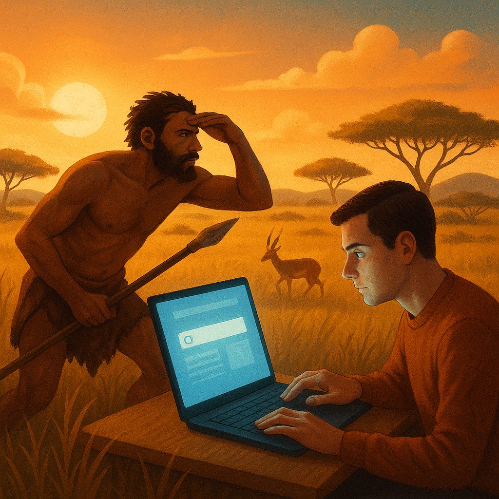
Thousands of years ago, your ancestors stood on the edge of a golden savanna, scanning the horizon for a specific kind of movement. They weren't looking at the scenery; they were looking for lunch. To survive, their brains had to become incredibly efficient at a specific type of math: calculating metabolic ROI, or return on investment. If a gazelle was three miles away, was the energy spent sprinting worth the calorie payout of the meat? If the berries on one bush were small and sour, was it time to move to the next valley? This ancient survival logic didn't vanish when we moved into air-conditioned offices and traded spears for smartphones.
Today, you are still a predator, but your prey is data. When you open a browser or scroll through an app, your brain treats a Wikipedia rabbit hole or a product comparison page exactly like a patch of forest. You are constantly scanning for what researchers call "information scent," those tiny digital clues that suggest your goal is nearby. If the scent is strong, you dig deeper; if the trail goes cold, your primitive brain screams that you are wasting energy and signals you to move on. Understanding this connection between biology and browsing reveals why we find some websites delightful and others physically exhausting.
The Evolutionary Blueprint of the Digital Hunter
To understand why we behave the way we do online, we have to look at the work of Peter Pirolli and Stuart Card. They developed Information Foraging Theory at Xerox PARC in the late 1990s. They noticed that human patterns of navigating the web were strikingly similar to the way animals hunt for food in the wild. In nature, food is rarely spread out evenly; it exists in patches, like a single fruit tree or a specific fishing hole. Animals must decide how long to stay in one patch before the effort of finding more food there exceeds the reward, making it more logical to travel to a new spot.
In the digital world, a website or a search results page is a patch. We enter the patch with a specific hunger, perhaps for the price of a flight to Tokyo or the name of an actor from a certain movie. Our brains immediately begin a cost-benefit analysis. The cost isn't just money; it is "interaction cost," which includes the physical effort of clicking and scrolling, as well as the mental effort of reading and deciding. If a page is cluttered or the navigation is confusing, the cost of hunting rises sharply. Humans are naturally "cognitive misers," meaning we will almost always choose the path that requires the fewest mental calories, even if we know a better reward might exist down a more difficult path.
Tracking the Scent of Information
Every predator needs a way to track its prey, and in the digital wilderness, we use information scent. This refers to the nearby clues, such as blue underlined links, icons, or bolded headings, that provide a hint of what lies ahead. Imagine you are looking for a sourdough bread recipe. You land on a homepage and see three links: "Our Story," "Bakery Secrets," and "Hard Wheat Varieties." Your brain instantly calculates which link smells most like a recipe. "Bakery Secrets" likely has the strongest scent, so you click it.
If that link takes you to a page that is actually just an advertisement for a baking class, the scent disappears. This is what designers call a "dark pattern" or an information scent bait-and-switch. When the scent fails, the hunter feels a flash of frustration. This isn't just an annoyance; it is an evolutionary alarm bell. In the wild, following a false scent meant starvation. In the digital world, it means you hit the "back" button and return to a hub, like Google or a main menu, to find a better trail. The strength of the scent determines how much friction a user is willing to endure. If you are 100 percent sure that clicking a button will give you exactly what you need, you will tolerate a slow loading time. If the scent is weak, even a half-second delay will make you abandon the hunt.
The Mathematical Trade-off of Staying or Leaving
One of the most profound insights from foraging theory is the Marginal Value Theorem. This concept explains the exact moment a person decides to leave a website. In biology, a bird stays at a berry bush until the rate of finding new berries drops below the average rate of finding berries in the rest of the environment, minus the "cost" of flying to a new bush. Translated to your laptop, you stay on a blog post as long as the value per second you gain is higher than the value you think you could get by leaving and starting a new search elsewhere.
This explains why we often skim headers rather than reading full paragraphs. Skimming allows us to get the most information possible while minimizing the time spent. When we hit a wall of dense, unformatted text, the rate of information gain drops to a crawl. The marginal value of staying on that page plummets, and our survival instincts tell us to jump. This is why "the fold," the part of the website visible without scrolling, is so vital. It acts as the initial survey of the patch. If the hunter doesn't see enough potential protein in those first few hundred pixels, they won't bother digging deeper into the site.
Comparing Natural and Digital Foraging Strategies
To make these concepts stick, it helps to see how the logic of the savanna translates directly to the logic of the browser. Below is a comparison of how the two worlds use the same survival mechanisms.
| Biological Foraging Concept |
Digital Foraging Equivalent |
Human Behavior Observed |
| Prey / Calories |
Desired Information / Data |
The user seeks a specific answer or entertainment. |
| The Patch |
A Website or Application |
A contained area where information is stored. |
| Foraging Scent |
Links, Labels, and Icons |
Cues that suggest the location of the desired data. |
| Diet Breadth |
Topic Specificity |
Deciding to look for "shoes" (broad) vs. "size 10 red heels" (narrow). |
| Locomotion Cost |
Clicks, Scrolls, and Page Loads |
The physical and time cost of moving through an interface. |
| Giving Up Time |
The Bounce Rate |
The moment the user decides the current site isn't worth the effort. |
Designing for the Hungry Brain
Once we accept that users are predators looking for the easiest meal, we can stop assuming they will work hard for "quality" content. Experience has shown that if a diamond is buried under six feet of mud, most people will just go buy a shiny piece of glass sitting on a pedestal. To build better digital experiences, we must reduce the "locomotion cost" of finding information. This means creating a clear, high-contrast information scent that guides the user from the moment they land on a page.
Effective design uses "signposting." Just as a trail in the woods uses markings on trees to keep a hiker on the path, a website should use descriptive headings and intuitive navigation. If a link says "Click here," it has no scent. It is a mystery box. But if a link says "Download the 2023 Tax Guide PDF," it has a powerful, specific scent. The user knows exactly what they are getting and exactly how much effort it will take. By removing the guesswork, you lower the mental workload, making the patch feel more profitable and keeping the hunter engaged for longer.
Correcting the Myth of the Lazy User
A common misconception in the tech world is that modern users have short attention spans or are simply "lazy." This is a fundamental misunderstanding of human biology. Users aren't lazy; they are efficient. They are performing a highly sophisticated, subconscious calculation designed to ensure their survival. When someone leaves your website after five seconds, it isn't because they lack focus. It is because they are too smart to waste their limited time and energy on a patch that doesn't seem to have any fruit.
If you provide a strong scent and a clear path, humans are capable of incredible focus. Think of someone who spends six hours straight researching a niche hobby or reading a long investigative report. They do this because the scent of the next discovery remains strong throughout the entire process. The moment the author goes on a tangent that doesn't provide value, or the website's pop-up ads interrupt the flow, the scent breaks. The hunt is over. The problem is rarely the depth of the content; it is the clarity of the trail.
The High Cost of Too Many Choices
In the wild, an animal is rarely faced with a thousand different types of prey at once. Usually, it is a choice between a few viable options. However, digital environments often suffer from giving users too many links, buttons, and paths. This creates "analysis paralysis," or choice overload. In foraging terms, if every tree in the forest smells equally like fruit, the predator becomes confused and eventually exhausted.
When we present a user with twenty different navigation options, we are forcing them to perform twenty different metabolic calculations: "Is this link better? How about this one?" This mental tax adds up quickly. To make a digital environment feel natural, we should limit choices to the most profitable ones. This doesn't mean hiding information, but rather organizing it in clusters or patches that make sense. By grouping related items together, we allow the user to hunt in one area before deciding to move to the next, mimicking the natural rhythm of the physical world.
Embracing Our Inner Predator
As you move through your digital day, start noticing the "scents" you follow. Observe that moment of hesitation when you click a link and find yourself on a page that doesn't look like what you expected. Feel that rising urge to hit the "back" button? That is your ancient, savanna-dwelling brain trying to save your life by conserving your energy. By recognizing these patterns, we can become more intentional about how we consume information and more compassionate toward the people we design for.
We are not just "users" or "consumers" of data; we are biological hunters navigating an increasingly complex landscape. When we align our digital tools with our evolutionary hardwiring, the technology disappears, and the hunt becomes effortless. You have the most powerful information-gathering machine in the known universe sitting right between your ears. Use it to find the best patches, follow the clearest scents, and never feel guilty for leaving a trail that has gone cold. The world is full of information, and you were born to hunt the very best of it.