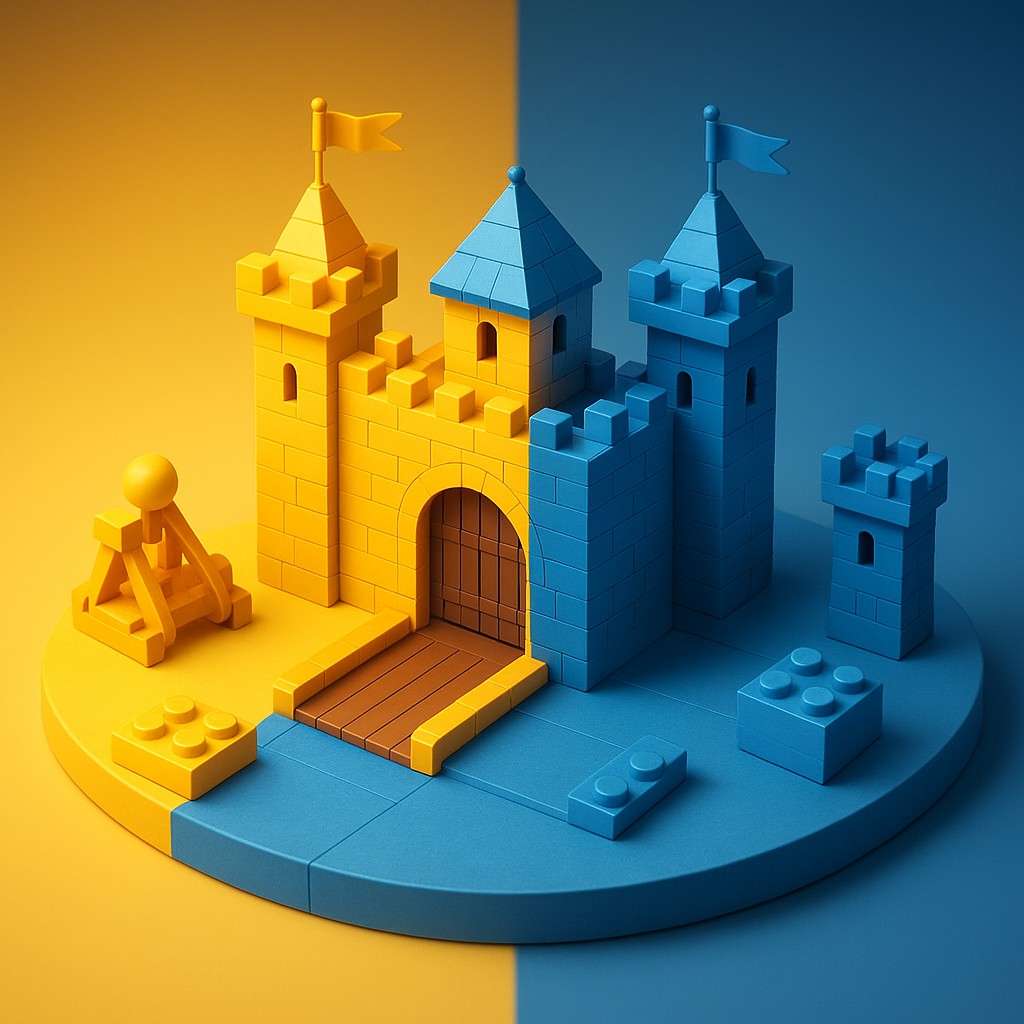
Imagine you are building a Lego castle. For years, the rules of the kingdom dictated that every single tower, drawbridge, and catapult had to look exactly the same regardless of where they sat on the carpet. If the sun went down, every piece turned blue. If the sun came up, every piece turned yellow.
This is the world of traditional responsive web design. For over a decade, we have been obsessed with the "viewport," which is just a technical term for the size of your browser window. If the screen is wide, the website shows four columns; if the screen is narrow, it stacks everything into one. It is a top-down approach where the "big boss" (the browser) tells every little worker exactly how to behave.
Modern web development is moving away from this central authority toward a model of localized intelligence. We are entering the era of the "self-aware" component. Think about a weather widget. In the old way of doing things, that widget only knew if it was on an iPhone or an iMac. It had no idea if it was squeezed into a tiny sidebar or stretched across the middle of a massive dashboard. This led to awkward layouts where a component looked great on a phone but appeared ridiculous when placed in a small box on a desktop screen. Container queries solve this identity crisis, allowing elements to look at their immediate surroundings and decide for themselves how to best present their information.
The Tyranny of the Viewport
To understand why container queries are a revolution, we first have to acknowledge the limits of their predecessor: media queries. Media queries were the backbone of "Responsive Web Design," a term coined by Ethan Marcotte in 2010. They allow us to write code that says, "If the browser window is at least 800 pixels wide, make the font size larger."
This worked beautifully when websites were just simple documents with a few sidebars. However, as the web evolved into a collection of complex, reusable parts, media queries started to feel like using a sledgehammer for dental work. They are too blunt and lack the precision required for modern, modular design.
The core problem is that a component’s "ideal" look depends on the space available to it locally, not the space available to the entire page. Let’s say you have a "Product Card" with an image, a title, and a price. On a mobile phone, that card likely takes up the full width of the screen, so it looks great. But what if you take that same card and place it into a narrow sidebar on a desktop computer? Even though the desktop screen is 2,000 pixels wide, the sidebar might only be 300 pixels wide. A media query would see that 2,000-pixel width and try to display a massive, wide version of the product card inside a tiny, narrow box. The result is a broken layout where text overflows and images look distorted.
Web developers spent years trying to hack around this. They would create dozens of specific styles like product-card--sidebar or product-card--footer to manually override the design based on where the component was placed. This led to "code bloat," where the files became a tangled mess of specific rules that were hard to manage and even harder to fix. Every time you wanted to move a part to a new section of the site, you had to write new rules to make sure it didn’t break. It was a fragile system that relied on the developer knowing exactly where every piece of the puzzle would land.
Teaching Components to Read the Room
Container queries change the fundamental logic of web design by shifting the focus from the browser window to the parent element. In this new model, we designate a specific part of the page as a "container." Once an element is labeled this way, the items inside it can ask questions about its dimensions. Instead of a global command from the browser, we get local intelligence.
The product card can now say, "If my immediate container is less than 400 pixels wide, I will stack my photo on top of my text. If it is wider than that, I will put them side-by-side." This happens regardless of whether the user is on a phone, a tablet, or a refrigerator with a built-in screen.
This shift allows for true modular design. In a modular system, you build a component once, and it carries its own layout logic with it like a backpack. You can drop that component into a header, a main content area, or a tiny pop-up menu, and it will automatically adjust its appearance to fill the space perfectly. This is the difference between a costume that only fits one person and a magical suit of armor that expands or contracts to fit whoever puts it on. It makes the web more resilient because the layout is determined by the actual physical constraints of the design rather than arbitrary screen sizes.
Technically, this is achieved through two main steps. First, you define a container using the container-type property. This tells the browser, "Keep an eye on how big this specific box is." Then, you use the @container rule to apply styles based on that box's size. It sounds simple, but for web developers, this is the equivalent of discovering that the Earth revolves around the sun. It flips the entire perspective of layout design, moving control away from the page and giving it to the components themselves.
A Comparative Look at Layout Logic
When we look at the transition from media queries to container queries, it helps to see exactly how the decision-making process changes. Below is a breakdown of how these two approaches handle common design challenges.
| Feature |
Media Queries (The Old Way) |
Container Queries (The New Way) |
| Primary Reference |
The total width/height of the browser window. |
The width/height of the parent element. |
| Reusability |
Low; requires extra rules for every new location. |
High; the component adapts automatically. |
| Code Complexity |
High; leads to messy code and many overrides. |
Low; layout logic stays inside the component. |
| Design Philosophy |
Top-down (The page dictates the layout). |
Bottom-up (The element dictates its own layout). |
| Maintenance |
Fragile; changing the page often breaks parts. |
Robust; components are self-sufficient. |
Using this table as a guide, we can see that container queries aren't just a new feature; they are a better architectural strategy. They allow developers to build "design systems" rather than just web pages. A design system is a collection of parts that work together harmoniously. Container queries are the glue that allows those parts to communicate with their environment without needing a central coordinator.
The Technical Mechanics of Containment
To implement this, a developer must first establish a "containment context." This is a way of telling the browser to calculate the layout of a specific box before it tries to figure out what is inside it. Usually, we do this by setting container-type: inline-size. The "inline-size" part specifically tells the browser to look at the width of the container. While you can also check the height, width is the most common use case because that is where most layout shifts happen on the web.
Once the container is defined, the child elements use the @container syntax. This looks very similar to a media query, which makes it easy for experienced developers to learn. For example, if you have a card inside a container, you might write code that changes the background color or the font size when the container hits a certain width. While the browser handles these calculations efficiently, it does require a bit more processing power to monitor individual boxes. This is why "containment" is so important; it tells the browser exactly which parts of the page need this extra attention.
/* 1. Define the parent as a container */
.sidebar, .main-content {
  container-type: inline-size;
  container-name: layout-zone;
}

/* 2. Tell the component to react to its parent's size */
@container layout-zone (min-width: 500px) {
  .profile-card {
    display: grid;
    grid-template-columns: 1fr 2fr;
    gap: 20px;
  }
}
In this code example, the .profile-card doesn’t care if the screen is 1,920 pixels wide or 400 pixels wide. It only cares about the size of the .sidebar or .main-content it lives in. If you move the card from the wide main section to the narrow sidebar, it will automatically switch from a two-column grid back to a simple stacked layout. This automation reduces the amount of testing a developer has to do. Instead of checking the site on every possible device, they only need to ensure the component behaves correctly across a range of container sizes.
Overcoming the Legacy of Older Browsers
As with any major shift in technology, there is always a transition period where the old and the new must coexist. Container queries are widely supported in modern browsers like Chrome, Firefox, Safari, and Edge. However, people still use older versions, and some corporate environments are stuck on legacy software. This creates a challenge: how do you use these amazing new tools without breaking the experience for people on older machines?
The solution is a strategy called "Progressive Enhancement." Developers write their basic layout using standard CSS that works everywhere, ensuring the content is readable and functional. Then, they layer container queries on top. If the user's browser understands them, they get the polished, tailored layout. If it doesn't, they still get a working website, even if it looks more basic. There are also "polyfills" - small pieces of JavaScript that mimic the behavior of container queries for older browsers - though these can sometimes slow down performance.
Despite these hurdles, the industry agrees that container queries are the future. The temporary inconvenience of supporting older browsers is far outweighed by the long-term benefits of cleaner code and more flexible designs. We are moving toward a web that is as fluid as water, flowing into containers of all shapes and sizes without losing its integrity.
Embracing the Future of Fluid Design
The move toward container-based design is more than a technical update; it is a shift in how we think about the digital world. We are moving away from rigid, page-based structures and toward organic, responsive ecosystems. By giving components the ability to sense their own environment, we are making the web smarter and more adaptable. This doesn't just make life easier for developers; it creates a better experience for users, who get to enjoy interfaces that feel custom-made for whatever device they are using.
As you explore the websites you visit every day, start looking for these subtle shifts. Notice how cards in a sidebar behave compared to cards in the middle of the page. See if you can spot elements that seem to "know" where they are. We are living through a quiet revolution in interface design that is making our digital tools more resilient, modular, and beautiful. The era of the "dumb" component is ending, and the era of the self-aware layout is just beginning. This newfound flexibility promises a future where the web is more accessible and delightful for everyone.