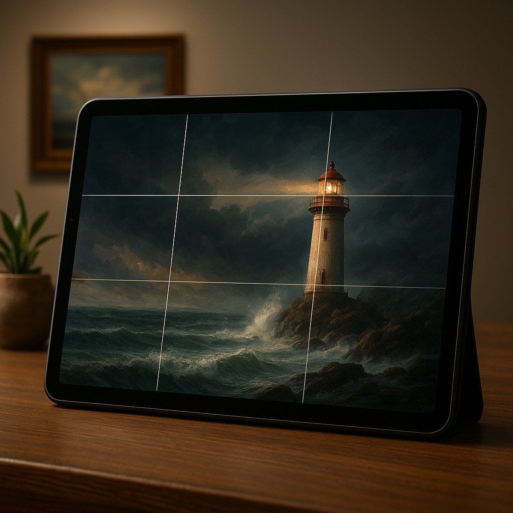
Imagine you are standing in an art gallery, staring at a breathtaking landscape painting of a lonely lighthouse against a stormy sea. If the artist had placed that lighthouse dead center, the painting might look fine, but it would likely feel static, like a dull passport photo of a building. Instead, the artist probably tucked the lighthouse slightly to one side, perhaps a third of the way into the frame. This allows your eyes to travel across the crashing waves before landing on the focal point. This isn't just an artistic whim; it is a calculated move based on how the human brain processes visual information. We are wired to seek out balance rather than perfect symmetry, and our eyes follow a secret map whenever they encounter a new image.
This same psychological phenomenon happens right under your thumb every time you unlock your phone. Whether you are scrolling through a sleek social media feed or trying to book a flight, the most "intuitive" experiences are rarely accidental. Designers use a hidden skeleton known as the Rule of Thirds to dictate exactly where your attention should land. By understanding how this grid works, we can move past the amateur mistake of centering everything and begin creating layouts that feel alive, organized, and effortless to navigate. It is the difference between a cluttered room and a well-designed sanctuary where everything is exactly where you expect it to be.
The Invisible Grid Governing the Screen
The Rule of Thirds is a simple concept borrowed from the world of classical photography and painting. It involves overlaying a grid of two horizontal lines and two vertical lines onto a design, creating nine equal boxes. While it might seem like just another way to slice up a rectangle, the magic happens at the four points where those lines cross. These intersections are known as "power points" or "sweet spots." From an evolutionary standpoint, our eyes do not naturally gravitate toward the center of a frame because the center is often "quiet" or empty in the wild. Instead, we scan the edges and the mid-sections to identify threats or resources, making those intersection points the prime real estate for any visual message.
In app and web design, these power points serve as the ultimate landing pads for information. If a designer places a "Sign Up" button or a main headline directly on one of these intersections, the user’s brain registers it almost instantly and with much less effort. This reduction in "cognitive load", or the mental energy required to process information, is the goal of great design. When a user doesn't have to hunt for the next step, they perceive the app as being fast and clever, even if the loading speed is actually average. The grid provides a sense of mathematical harmony that the subconscious mind craves.
Moving Beyond the Trap of Perfect Symmetry
One of the most persistent myths in design is that the center is the most important part of the screen. We are taught from a young age to put the title of our school reports in the middle of the page and to center our signatures on documents. However, in a digital environment, the dead center can often feel "stuck." Centering a single element creates a formal, rigid feeling that lacks energy. It tells the eye to look here and nowhere else, which sounds useful until you realize that most apps need you to look at a headline, then a description, and finally a button. A centered layout often fails to create a clear path for the eye to follow.
When we intentionally move an element using the Rule of Thirds, we create what designers call visual tension. This isn't the stressful kind of tension you feel before a test, but rather a dynamic energy that encourages the viewer to keep looking. By placing a product photo on the left-hand vertical line and the descriptive text on the right-hand power points, you create a conversation between the elements. The eye bounces from the image to the words, creating a flow of information. Symmetry is beautiful for a wedding cake, but for a tool you use every day, asymmetry guided by the Rule of Thirds provides the rhythm necessary to keep the experience engaging.
Mapping the User Journey Through Power Points
To truly master this technique, one must understand that not all four power points are equal. In Western cultures, where we read from left to right and top to bottom, the top-left intersection is the most important spot on the screen. This is usually where vital information lives, such as a company logo or a greeting. From there, the eye typically moves in an "F" or "Z" pattern across the other intersections. This predictable journey allows designers to guide the user, placing secondary information on the top-right and the final "Call to Action", or the main button they want you to click, on the bottom-right or bottom-left points.
Imagine a food delivery app. If the photo of a pizza sits on the left side of the upper-third line, and the "Order Now" button sits on the bottom-right intersection, the user’s eye naturally slides down a diagonal path across the screen. This mimics the way we naturally scan our environments. We start with the "hook" and end with the "action." If those elements were scattered randomly, the brain would have to work overtime to connect the "I want that" thought with the "How do I get it?" action. By lining them up with the grid, the designer makes the decision-making process feel like a smooth slide rather than a rocky climb.
Comparing Layout Strategies for Maximum Impact
While the Rule of Thirds is powerful, it is helpful to see how it compares to other common layout styles. Many beginners confuse it with the Golden Ratio or simple centered layouts. The following table breaks down how these different approaches impact a user and when they should be used.
| Layout Style |
Psychological Effect |
Best Use Case |
| Centered |
Formal, Static, Stable |
Login screens, "Thank You" messages, simple logos. |
| Rule of Thirds |
Dynamic, Professional, Balanced |
Landing pages, product showcases, dashboard layouts. |
| Golden Ratio |
Natural, Organic, Complex |
Highly aesthetic artistic sites, brand identity systems. |
| Grid Heavy |
Organized, Dense, Technical |
Spreadsheets, news sites, file managers. |
As shown above, the Rule of Thirds sits in the "just right" zone. It is more interesting and functional than a centered layout, but it is easier to build and follow than the complex Golden Ratio. It strikes an ideal balance between the rigid structure needed for a functional app and the visual flair needed to keep a user interested.
Visual Breathing Room and the Power of Negative Space
A common mistake when first learning about the Rule of Thirds is the urge to fill every single intersection with an object. If you put a button on the top-left, a photo on the top-right, a menu on the bottom-left, and an ad on the bottom-right, you haven't created a masterpiece; you've created a junk drawer. The Rule of Thirds works best when it is used to manage "white space," or negative space. By aligning an element with one line of the grid, you naturally leave the other two-thirds of the screen relatively empty. This emptiness is not wasted space; it is breathing room that allows the important elements to stand out.
Negative space acts like the silence between notes in a song. Without the silence, the music is just noise. In design, if you place your main image along the right-hand vertical third, the empty space on the left pushes the viewer's focus toward that image. It creates a sense of luxury and purpose. When a screen is packed from edge to edge, it feels cheap and frantic. Using the grid to deliberately leave sections of the screen open tells the user that you respect their time and attention. This builds trust, as the user feels they are in the hands of a professional who isn't trying to shout everything at once.
Avoiding Common Pitfalls in Grid-Based Design
Even with a grid in place, it is possible to lose your way. One frequent error is following the grid too strictly, where a designer tries to force an element to align perfectly with a line even if it looks slightly off to the eye. The Rule of Thirds is a guideline, not a law. Sometimes, because of the shape of an icon or the weight of a font, you might need to nudge an element a few pixels away from the intersection to make it feel right. This is known as optical alignment. Trust your eyes over the grid lines if the two conflict, because your users don't see the grid; they see the result.
Another pitfall is forgetting how the eye scans the page. While the power points are great for placing objects, the lines connecting them are the highways the eye travels. If you place a very heavy, dark element at the bottom-left and a very light, tiny element at the top-right, you are asking the eye to travel "uphill," which feels unnatural. Generally, you want the visual weight to flow in a way that feels downward or forward. Using the Rule of Thirds to anchor your heaviest elements in a way that helps this natural movement will prevent the layout from feeling clunky or "upside down."
Practical Implementation in Modern Tools
Applying this today is easier than ever because almost every modern design tool has "Snap to Grid" features or built-in Rule of Thirds overlays. When you start a new project, you can set your layout grid to three columns and three rows. This immediately gives you your four power points. From there, the process is like a puzzle. You can experiment by moving your main headline to the top-left intersection and your main button to the bottom-right. Notice how the diagonal of the screen suddenly creates a sense of movement.
Even if you are not a designer and are just building a website with a basic tool, you can still apply this. Look at your chosen template. Does it feel cluttered? Try moving the text so it is not centered but instead takes up the left third of the screen, leaving the right two-thirds for a large, high-quality image. You will notice the professional feel of the site improves instantly. By simply refusing to center every element, you separate yourself from most beginners. This technique is a shortcut to professional results, giving you a framework to make decisions based on science rather than just a "feeling."
Harnessing the Power of Visual Instinct
The beauty of the Rule of Thirds lies in its invisibility. Your users will never pull out a ruler and check if your logo is perfectly aligned. Instead, they will simply feel a sense of relief and clarity when using your product. They will find what they need faster, stay on the page longer, and likely describe your design as clean and modern. These are all just another way of saying that the design matches how their brains naturally want to see the world.
As you move forward, start looking for these grids everywhere. Look at the balance of the next movie poster you see, or notice how a talented photographer frames a mountain peak slightly to the side rather than in the middle. Once you see the Rule of Thirds, you cannot unsee it, and that is your new superpower. By using the power points and respecting the elegance of off-center balance, you can transform any digital space from a chaotic mess into a smooth, intuitive journey. Design with the confidence that you are not just placing buttons, but are speaking the secret language of the human eye.