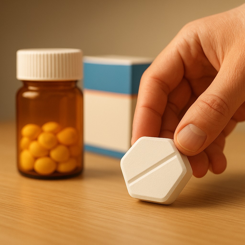
Imagine standing in front of your bathroom mirror at 7:00 AM. You are bleary-eyed and reaching for a small, familiar bottle. You pop the cap and shake out a pill. For years, your cholesterol medication has been a tiny, bright yellow circle. But today, the pharmacy has switched you to a generic version. You look down and see a large, white, hexagonal tablet. Even though your doctor and pharmacist both swore this new pill is chemically identical to the old one, a tiny voice in the back of your head whispers that something is wrong. You might even find yourself wondering if this "cheaper" version will actually work, or if you are being cheated out of the real deal.
This feeling is not just a personal quirk; it is a global phenomenon that costs billions of dollars and impacts the health of millions. It turns out that when we take medicine, we aren't just swallowing a cocktail of molecules designed to hit our biological targets. We are also consuming a carefully crafted visual experience. In the world of pharmaceutical marketing, a pill's "trade dress" - its color, shape, size, and even the texture of its coating - is a fortress of intellectual property. This creates a strange paradox: by law, the most important part of a drug must be identical, while the least important part must be different.
The Legal Architecture of the Medicine Cabinet
To understand why your pills look the way they do, we have to look past biology and into the world of trademark law. While a patent protects the "recipe" for a drug, patents eventually expire, usually after 20 years. When that happens, other companies are allowed to manufacture generic versions. However, while the patent on the chemical formula expires, the trademark on the drug's appearance often does not. This is known as "trade dress." Just as Coca-Cola owns the specific shape of its glass bottle and Tiffany & Co. owns a very specific shade of blue, pharmaceutical companies own the visual identity of their best-selling products.
Think of the "Little Purple Pill," the famous branding for the heartburn medication Nexium. AstraZeneca did not just market a chemical; they marketed a color. When generic manufacturers entered the market, they were legally barred from making their pills purple. They could provide the exact same active ingredient, esomeprazole, but they had to wrap it in a different visual package. This legal requirement forces the products to look different. If a generic company tried to make an identical purple pill, they could be sued for "passing off" or confusing consumers, even though the medicine inside is exactly the same.
This leads to a fascinating market dynamic. Pharmaceutical giants use these visual markers to build a sense of "premium" quality that survives long after their chemical monopoly ends. By the time a patent expires, patients have often spent a decade or more associating their recovery with a specific blue diamond or a red-and-white capsule. The law protects this visual bond, ensuring that even when the science becomes public property, the brand remains a private asset. This creates a psychological barrier for generics that has nothing to do with chemistry and everything to do with the "vibe" of the medication.
The Bioequivalence Rule and the Margin of Variation
One of the most common myths about generic drugs is that they are "close enough" but not quite the same as the brand name. In reality, the regulatory standards for generic drugs are incredibly strict, focused on a concept called bioequivalence. For a generic drug to be approved by agencies like the FDA in the United States or the EMA in Europe, it must contain the same active ingredient, come in the same dosage form, and be taken the same way. Most importantly, the bio-availability - the rate and amount of the active ingredient absorbed into the bloodstream - must be virtually the same.
While there is a technical window allowed for variation, usually cited in the range of 80 percent to 125 percent, the public often misunderstands this. This range does not mean your generic has 20 percent less medicine. It refers to a statistical "safety net" regarding how the drug moves through the body over time. In practice, the actual difference in absorption between brand-name and generic drugs is tiny, usually averaging around 3 to 4 percent. This is effectively the same amount of variation you might find between two different batches of the brand-name drug itself.
| Feature |
Brand-Name Drug |
Generic Drug |
| Active Ingredient |
Identical |
Identical (Required by law) |
| Purity and Potency |
Regulated Standard |
Same Regulated Standard |
| Bio-availability |
Baseline |
Must be Bioequivalent |
| Visual Appearance |
Trademarked / Protected |
Must be Legally Different |
| Inactive Ingredients |
Proprietary Mix |
Can vary (Binders, fillers, dyes) |
| Manufacturing Cost |
High (Includes R&D) |
Low (Reverse engineered) |
Despite these similarities, the law insists that the inactive ingredients - things like binders, fillers, and dyes - can be different. This is partly for manufacturing reasons and partly to avoid stepping on the brand's trademarked look. Because these "excipients" (the non-medicinal parts of a pill) differ, the physical experience of taking the pill might change. A generic might dissolve slightly differently in the mouth, or the coating might be less slick. While these changes do not affect the drug's ability to lower your blood pressure or fight an infection, they reinforce the patient's feeling that the medicine has changed fundamentally.
Crossing the Placebo Gap
The most profound impact of a "visually different" generic is not in the stomach, but in the brain. We have known for a long time that the placebo effect is powerful, but we are now learning that it is also highly specific to how a pill looks. If you give someone a red pill and tell them it is a stimulant, it will work better than a blue pill. Conversely, blue pills are perceived as better sedatives. The color of the medicine shapes what the patient expects it to do.
When a patient who has been stable on a brand-name drug for years is suddenly switched to a generic that looks different, they often experience what researchers call the "Nocebo Effect." This is the evil twin of the placebo effect. Because the pill looks "wrong" or "cheap," the patient perceives it to be less effective. They might even begin to experience real, physical side effects simply because they are anxious about the change. This is the "Placebo Gap," the space where clinical results and patient perception drift apart because of a change in color or shape.
Studies have shown that patients are significantly more likely to stop taking their medication if the appearance of the pill changes. This is a massive public health issue. If a heart attack survivor stops taking their statin because the new generic pill is a different shape and they no longer "trust" it, the legal protection of a pill's shape has suddenly resulted in a life-threatening situation. This "distrust by design" is an unintended consequence of trademarking the look of health. We have reached a point where a pharmaceutical brand, designed to protect profits, can actively get in the way of a patient's recovery.
The Global Price of a Pretty Pill
The financial consequences of these visual monopolies are staggering. In many parts of the world, branded drugs can cost ten to fifty times more than their generic counterparts. In developing nations, the "trust" built into a specific brand-name look can be a barrier to affordable healthcare. If people believe that only the "blue capsule" works, they will bankrupt themselves to buy it rather than taking the equally effective, government-provided white tablet. This allows pharmaceutical companies to maintain high prices even in markets where the patent lapsed long ago.
Companies often use "product line extensions" to manipulate consumer psychology. A company might introduce a "new and improved" version of a drug just as the old one is about to lose its patent. This new version will have a new, even more distinct look. The company then spends millions on advertising to convince patients that the old shape, which generic companies are now copying, is outdated, and the new "gold triangle" shape is the only way to get the latest science. It is a masterful use of design to keep patients on the more expensive side of the pharmacy counter.
However, some countries are starting to push back. Regulations in certain areas are beginning to prioritize patient health over corporate trademarks. There is an ongoing debate about whether "functional" aspects of a drug, like its color and shape, should be allowed to be trademarked at all. If the shape of a pill helps an elderly patient with poor eyesight tell their heart medicine apart from their water pill, is that shape a "brand" or is it a "medical feature"? If it is a feature, it shouldn't be locked away behind intellectual property laws once the patent is gone.
Decoding Your Prescription
The next time you pick up a prescription and notice that your pills have changed from circles to ovals, or from pink to white, you aren't just seeing a manufacturing choice. You are seeing the intersection of two massive systems: the rigorous world of biology and the fierce world of corporate branding. You are witnessing the end of a legal monopoly and the birth of a generic competitor.
Understanding this dynamic is a superpower for the modern patient. When you realize that the "authenticity" of a drug's look is a legal creation rather than a biological one, you can close the Placebo Gap for yourself. You can look at that generic pill and recognize that while it might not have the "designer" outfit of the original, the engine under the hood is exactly the same. By focusing on the science rather than the appearance, you can navigate the healthcare system with more confidence, saving money without sacrificing your health.
In the end, the most important part of the medicine is the chemistry, not the shade of purple. As we move toward a more transparent medical future, the hope is that we will value the science at least as much as the packaging. Until then, remember that medicine is the only product where the law requires the "copy" to be just as good as the "original," even if it has to wear a different hat. Embrace the white hexagon; your blood pressure, and your wallet, will thank you.