Imagine walking into a massive international airport terminal after a grueling ten-hour flight. You are exhausted, your phone is struggling to find a signal, and you have exactly forty minutes to catch your connection. In many modern buildings, this would be the recipe for a panic attack as you hunt for a directory map that is inevitably hidden behind a vending machine. However, in a truly well-designed space, you don't look for a map. Instead, you look at the building itself. You notice the ceiling rising over the main walkway, the floor changing from carpet to polished stone, and a distant wall of glass revealing the airfield. Without reading a single word, your brain has already figured out the "logic" of the building. You know where to go because the architecture is speaking to you in a language your instincts already understand.
This phenomenon is known as architectural legibility. It is the art and science of making a complex environment "readable" so that people can form a clear mental map without overtaxing their brains. When a building is legible, it feels welcoming and safe. When it is illegible, it feels hostile, like a maze designed to trap you in a cycle of frustration. We often think of wayfinding as a series of arrows and icons, but for architects and urban planners, signage is often seen as a "patch" for a deeper failure in design. If a building requires a forest of signs to keep people from getting lost, the layout itself has failed to communicate its purpose. By understanding how we perceive space, we can begin to see the hidden cues that guide us through our daily lives.
The Mental Map and the Ghost of Kevin Lynch
To understand why we get lost, we first have to understand how we find our way. In the 1960s, an urban planner named Kevin Lynch changed how we think about space with his book "The Image of the City." Lynch argued that people navigate by building "mental maps," which are internal pictures of our surroundings based on five key elements: paths, edges, districts, nodes, and landmarks. Whether you are navigating a sprawling city like London or a massive hospital, your brain is constantly looking for these structural anchors to figure out where you are and where you are going.
Legibility is the measure of how easily these mental maps can be formed. In a highly legible environment, the edges (like a coastline or a major train line) are distinct, and the nodes (key intersections) are clear. When you enter a building, your brain immediately starts scanning for these anchors. If you can’t find them, your "cognitive load" spikes. Cognitive load is the amount of mental effort the brain uses to process information. When you have to stop every ten feet to decipher a map or guess which hallway leads to the exit, you are burning mental fuel that should be saved for your actual task. Legible design moves this work from your conscious mind to your intuition, allowing you to navigate "on autopilot" while thinking about your upcoming meeting or what you want for dinner.
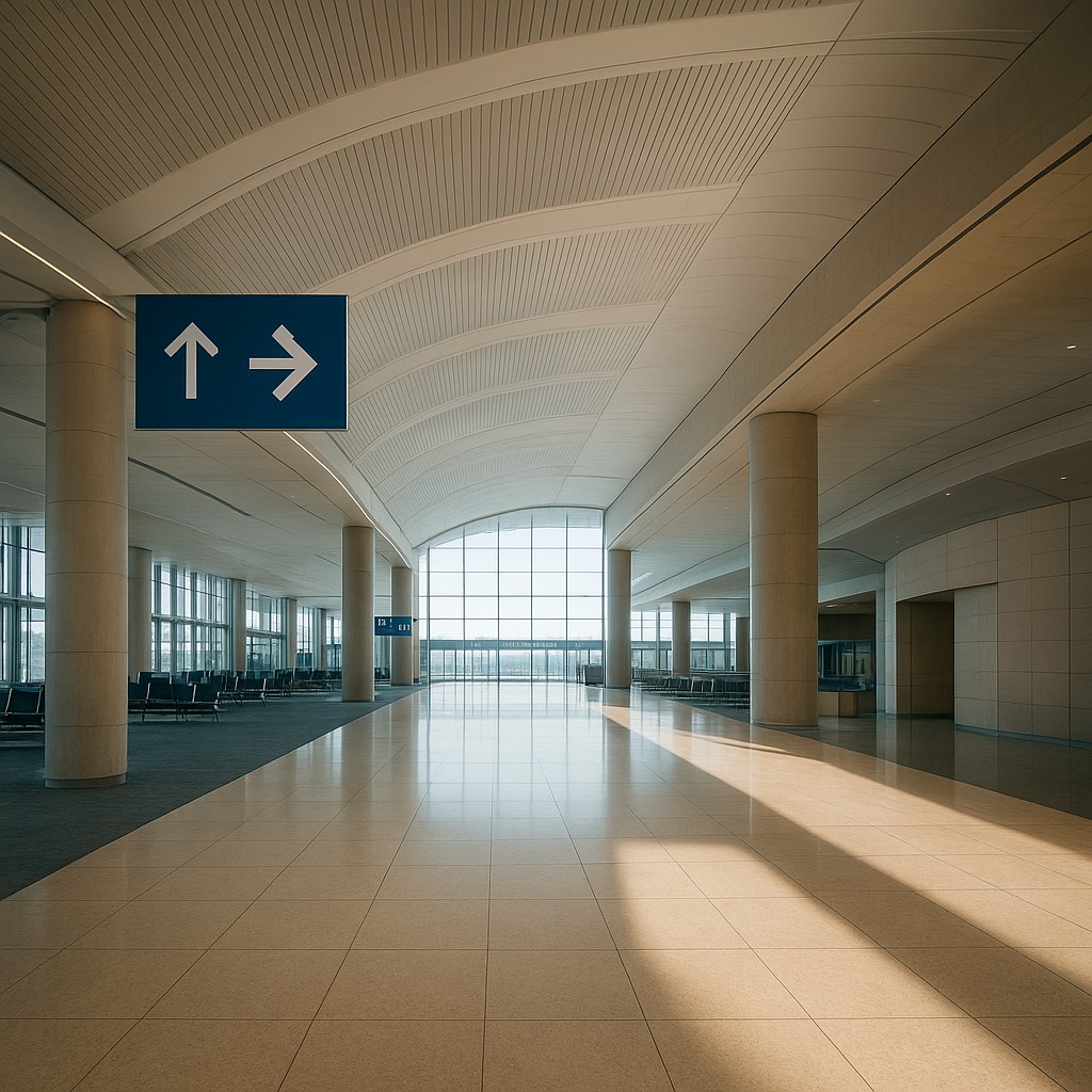
Sightlines: The Story Told by Space
One of the most powerful tools an architect uses to create legibility is the sightline. A sightline is simply the clear, unobstructed line of vision between a person and a target. In a legible building, designers make sure that major destinations-such as check-in counters, elevators, or exits-are visible the moment you walk through the door. This creates a visual narrative. Instead of telling you where to go with a sign, the building shows you where you are going by framing the destination.
Consider the design of a grand hotel lobby. Often, the elevators are not hidden down a dark corridor. Instead, they are framed by architectural details, perhaps set within a lit alcove. Even if the elevators are fifty feet away, your eyes are drawn to them immediately. This reduces the anxiety of the unknown. By providing "long views" that allow you to see across different parts of a building, designers help you understand the scale and the relationship between different sections. When you can see the destination, you don't need a map to tell you how to get there; your internal compass handles the rest.
The Subtle Language of Floors and Ceilings
While sightlines provide the "where," the physical surfaces of a building provide the "how." Architects use changes in texture and height to signal the importance of a space. This is a form of non-verbal communication that taps into our evolutionary instincts. For thousands of years, humans have associated open, high-ceilinged spaces with public gatherings and safety, while low, narrow spaces suggest privacy, transition, or even danger. When you move from a wide airport corridor with a thirty-foot ceiling into a smaller side room with an eight-foot ceiling, your brain subconsciously registers that you have moved from a "public" zone to a "private" or "service" area.
Floor textures work the same way. In many transit hubs, the main walking paths are paved with hard, noisy materials like granite or tile. These materials reflect sound and feel "fast" underfoot. If you step off that path toward a seating area, you might find that the floor changes to carpet. This change in feel does two things: it physically slows you down and signals a change in the room’s purpose. You have moved from the "river" of traffic into a quiet area of rest. This transition happens without you ever looking down. Below is a summary of how these environmental cues translate into human intuition.
| Environmental Feature |
Psychological Signal |
Likely Functional Area |
| High Ceilings / Bright Light |
High importance, public access |
Main hall, lobby, atrium |
| Low Ceilings / Dimmer Light |
Lower importance, private or cozy |
Offices, restrooms, lounges |
| Hard Flooring (Stone, Tile) |
High movement, fast pace |
Entryways, main walkways |
| Soft Flooring (Carpet, Rugs) |
Slow movement, pause, quiet |
Waiting areas, bedrooms, libraries |
| Transparent Glass Walls |
Openness, direction, connection |
Observation decks, exit paths |
| Solid Walls / No Windows |
Enclosure, security, utility |
Storage, mechanical rooms, vaults |
The Hierarchy of Light and the Beacon Effect
Light is perhaps the oldest navigation tool in human history. Just as a lighthouse guides a ship to port, "beacons" of light within a building act as anchors for our attention. We are naturally drawn to light. Designers use this to help us tell the difference between main routes and side paths. A common mistake in poor design is "uniform lighting," where every square inch of a building is lit with the same intensity. This creates a flat, confusing environment where nothing stands out as important.
In a legible building, designers use "accent lighting" to create a hierarchy. A bright wash of light over an escalator or a lit piece of art at the end of a long hallway acts as a visual "period" or a "comma" in the architectural sentence. It tells you that this is a place of interest or a point of transition. By contrasting these bright spots with slightly dimmer areas, the architect creates a path of least resistance for your eyes to follow. This is why you will often see skylights or large windows at the ends of hallways; the natural light pulls you forward, ensuring you never feel like you are walking into a dead end.
When Signs Are a Symptom of Design Failure
It is a common mistake to think that more signs lead to better navigation. In reality, the opposite is often true. In the design world, there is a saying: "If a building needs a sign to tell you where the front door is, the architect has made a mistake." Signage should be an extra layer of information that provides specific details, like room numbers or gate letters, rather than the primary way to understand the layout. When a space is truly legible, the physical shape of the building does 90% of the work, and signs simply confirm what you already suspect.
Think of a "desire path"-those dirt trails that form across grassy parks where people take a shortcut instead of using the paved sidewalk. A desire path is the ultimate expression of human intuition over designed intent. In legible architecture, the designer anticipates these natural movements and aligns the building's layout with them. If people are constantly getting lost in a specific wing of a hospital, adding ten more "EXIT" signs usually won't fix the problem if the layout goes against the natural flow of movement. The fix is usually structural: opening up a view, changing the lighting, or altering the floor materials to better align with how people actually see the space.
The Importance of Distinct Landmarks
For a mental map to work, it needs landmarks-unique features that stand out from the background. In a generic office building where every hallway looks identical, your brain struggles to find "hooks" to hang its map on. This is why many massive structures, like shopping malls or university campuses, use "themed" zones or unique architectural details to create distinctiveness. If you know that the "Blue Atrium" always leads to the parking garage and the "Glass Bridge" leads to the library, you have created a mental shortcut that removes the need for constant navigation.
Distinctiveness also helps people feel a connection to a place. When we can easily navigate a space and understand its logic, we feel more in control and less stressed. Research in environmental psychology has shown that legible environments can actually lower heart rates and reduce stress hormones. This is especially critical in high-stress places like hospitals or airports, where people are already likely to be anxious. A legible building isn't just a matter of convenience; it is a matter of public health and emotional well-being. By designing for the human brain's natural ability to recognize patterns, we create spaces that empower people instead of confusing them.
The next time you find yourself navigating a complex building with ease, take a moment to look up and around. Notice the height of the ceiling, the way the light hits the floor, and the long views that lead your eyes toward your destination. You are participating in a silent conversation with the designer, one that relies on thousands of years of human intuition. Understanding architectural legibility allows us to appreciate the invisible structures that guide our lives, reminding us that the best design is often the kind you don't even notice. When we build with the human mind in focus, we create a world that is not just functional, but deeply, intuitively readable.