You enter a nearly empty room and, unexpectedly, you relax. Nothing screams for attention. There is no designer chair hogging the spotlight, no gallery wall trying to prove a point. Still, the space feels right, as if it has quietly practiced how to welcome you.
That feeling is not magic, and it is not reserved for people with big budgets or a degree in interior design. Simple spaces feel satisfying because good design is less about how many objects you own and more about how your body and brain experience the room. At its best, good design is a gentle choreography: light meets surfaces, paths stay clear, proportions make sense, and everything has a role.
The fun part is that a small set of principles explains most of this. Once you know what to look for, you see why one minimalist café feels cozy and another feels like a dentist's waiting room. The difference is usually not more stuff. It is better choices.
The invisible promise of a simple room: clarity without boredom
A well designed simple room makes a quiet promise: "You do not have to work to be here." Your eyes can take it in quickly, and your body can move without negotiating obstacles. Simplicity often feels calming because it cuts down the visual and physical problem-solving your brain has to do.
Clarity is not the same as emptiness. A bare room can feel cold if nothing anchors your attention or gives the space a purpose. The trick is a clear hierarchy: the room should quietly answer, What is this space for, and where should I look? In a living room, that might be the seating area. In a bedroom, it might be the bed and the light around it.
One useful mental image is to think of the room as a sentence. Minimalism is not deleting words until nothing is left. It is choosing fewer words that still say something complete. A well designed simple room feels like a crisp sentence: short, specific, and surprisingly expressive.
Proportion and scale: when nothing is wrong, everything feels right
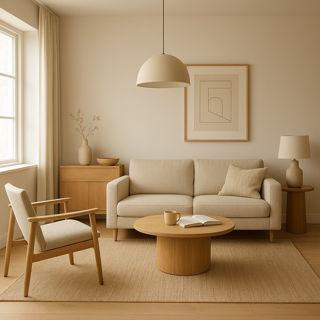
Many people assume a space feels good because of trendy furniture or expensive finishes. Often it feels good because the sizes of things make sense together. Your brain is always comparing proportions, and it notices when something is off even if you cannot name why. A tiny rug under a big sofa makes the sofa look like it is floating, which feels uneasy. A giant coffee table in a small room makes movement tight, as if the room is holding its breath.
Scale is about how objects relate to the human body. A chair can be beautiful, but if the seat is too high or the back too upright, it will never feel welcoming. Proportion is about relationships between objects: sofa to rug, bed to nightstand, pendant light to table, art to wall. Simple rooms have fewer pieces, so proportion matters more. Each piece stands exposed, like a soloist without an orchestra.
A practical rule is to make the big shapes work first: the bed, sofa, dining table, rug, and major storage. If those are the right size and placed well, the rest almost designs itself. If they are wrong, no amount of cute accessories will fix the feel.
Light does the heavy lifting: brightness, shadow, and mood
Light is the most underrated piece of furniture in a room because it does not take up floor space, yet it changes everything. A simple space can feel rich when light creates soft gradients, highlights textures, and gives direction. The same space can feel flat when lighting is harsh, uniform, or comes only from a single overhead source that turns everyone into a tired raccoon.
Good lighting in simple rooms usually has layers. You want ambient light (overall illumination), task light (for reading, cooking, working), and accent light (to add emphasis and depth). Even one extra lamp can transform a room because it adds a second angle of light, which creates shadow and makes objects look three-dimensional. Shadow is not the enemy; it is what gives a space visual flavor.
Natural light matters, but not in a "more is always better" way. Intense sunlight with no control can feel glaring and uncomfortable. Sheer curtains, blinds, or a well placed plant can filter light so it feels gentle rather than aggressive. The goal is not to flood the room, it is to shape the light so it feels intentional.
The layout that respects your body: flow, friction, and tiny inconveniences
A well designed room makes movement feel easy. You can walk through without turning sideways, sidestepping awkward corners, or doing that little "excuse me" dance with furniture. That ease is flow, and it is one of the fastest ways to make a simple room feel elevated. Remove friction, and the space feels bigger and calmer even if the square footage stays the same.
Flow depends on clear paths and sensible zones. A zone is a small area with a purpose: a reading corner, a dining spot, a work surface, a sleeping area. Simple spaces shine when zones are implied rather than loudly announced. A rug can define a seating zone, a pendant can mark a dining zone, and a small shelf can serve as an entry landing for keys and bags.
Tiny inconveniences add up. If you have to move a chair to open a cabinet, you will slowly start hating your kitchen. If there is nowhere to toss your jacket, it will end up draped over a chair and the chair will become the room's chaos monument. Simple design works when it anticipates these micro-moments and gives them a home.
Restraint with personality: the difference between simple and sterile
One big misconception is that simple design means losing personality. People worry minimal rooms must look like an art gallery where you are afraid to breathe. The truth is that simplicity works best when you keep a few clear signals of who lives there. The secret is to be selective, not neutral.
Personality can come from one bold artwork, a vintage chair, a handmade bowl, or a bookshelf that actually holds books you have read, not just "books that look tall." In a simple room, each item has more visual power, so you can choose fewer items that mean more. The result feels curated rather than underfurnished.
A good rule is: fewer items, greater intimacy. Instead of many small decorations, pick a few things with texture, story, or function. That keeps the room calm, but not staged like a rental listing where no one is allowed to own socks.
Materials and texture: how to add richness without adding clutter
When you remove many objects, surfaces become the main event. Texture is how you keep a simple room from feeling flat. Texture can be soft (linen curtains), nubby (a wool rug), smooth (a wood tabletop), glossy (a ceramic lamp), or matte (a painted wall). The room becomes interesting because light reacts differently to each material, creating subtle variety without visual chaos.
You do not need lots of color to avoid boredom. Color helps, but texture often does the job more elegantly. A limited palette can feel luxurious if it has depth: a chunky knit throw, a slightly imperfect handmade vase, natural wood grain, a woven shade. Think of it like cooking. You can make a great dish from few ingredients if you have contrast in salt, crunch, and acidity. Rooms work the same way.
Balance hard and soft. Too many hard surfaces (glass, metal, bare floors) can feel echoey and cold. Too many soft surfaces can feel sleepy. A well designed simple room usually mixes them, like a conversation where not everyone is shouting and not everyone is whispering.
Order that does not feel strict: the quiet power of hidden storage
People often assume tidy rooms belong to tidy people. Sometimes, but the real secret is storage that matches how you live. If you want a simple space to stay simple, you need homes for the unglamorous stuff: charging cables, mail, cleaning supplies, extra blankets, random screws you think might be useful someday.
Well designed simple rooms hide clutter without pretending you are a different person. Closed storage (drawers, cabinets, lidded baskets) is especially helpful because it cuts visual noise. Open shelves can be beautiful, but they need curating, dusting, and resisting the urge to place every object you own on display as if it were auditioning for a museum.
Create "landing zones" near where life happens. Near the door, have hooks and a tray for keys. Near the sofa, have a side table with a drawer. Near the bed, a basket for tomorrow's outfit. Simple spaces feel well designed when they prevent mess rather than scold you after mess appears.
A cheat sheet for simplicity that still feels designed
If you want something to try right away, here is a quick comparison of what often separates a plain simple room from a well designed simple room. Notice the difference is intention, not price.
| Design element |
Looks "simple but off" |
Feels "simple and well designed" |
| Furniture scale |
Pieces too small or too bulky for the room |
Key pieces fit the room and each other |
| Lighting |
One bright overhead light, flat mood |
Layered lighting, warm and directional |
| Color palette |
Random neutrals with no anchor |
Limited palette with one clear accent or tone |
| Texture |
Smooth surfaces everywhere, feels sterile |
Mix of textures, soft plus hard, matte plus sheen |
| Layout |
Paths blocked, furniture pushed without purpose |
Clear zones, easy movement, intentional placement |
| Decor |
Many small items scattered |
Few meaningful items with visual breathing room |
| Storage |
Clutter visible, "nowhere to put it" |
Hidden storage and landing zones that match habits |
Small choices that create big "design energy"
Design energy is that sense that the room is awake and coherent. The good news is you can create it with small moves. Most simple spaces do not need a full makeover, they need edits and a couple of targeted upgrades.
A few high-impact changes that work in many rooms:
- Anchor the room with one "main piece" that states the function, like a sofa that faces a focal point or a bed with balanced nightstands.
- Add one extra light source, ideally a lamp at eye level, to create depth and evening comfort.
- Use one large statement item instead of many small ones, like one big art print rather than a cluster of tiny frames.
- Give clutter an assigned home, even if it is just one attractive basket or a drawer organizer.
- Create breathing room by leaving at least one surface or corner intentionally more open than the rest.
None of these moves require perfect taste. They require noticing what the room is trying to do and helping it do that job with less struggle.
The designer’s secret: coherence beats complexity
If there is one idea to remember, it is that "well designed" is mostly about coherence. Coherence means your choices agree with each other: scale makes sense, lighting supports the mood, layout respects movement, and materials feel intentional. Complexity is optional. Coherence is what your brain recognizes as quality.
This is also why copying a Pinterest photo can fail. You may copy the objects but miss the relationships: the right rug size, the proper lamp height, the spacing between furniture, the way curtains soften window light. Those quiet rules do the heavy lifting, and once you see them you can recreate the feeling in your own space with your own style.
A simple room that feels good is not an empty room. It is a room where every element pulls in the same direction, like a group project where someone actually made a plan and nobody scrambled at the last minute.
A closing note for your next room refresh
The most empowering thing about simple, well designed spaces is that they are built from decisions, not decorations. Start with what you already have and adjust one relationship at a time: move the chair, change the bulb, add a texture, hide a cable, upgrade the rug size. As you practice, you will develop an instinct for what feels calm, clear, and human.
So the next time you step into a space that feels quietly excellent, do not just think, "Wow, nice." Ask, "What is it doing?" Then borrow that move. Design is not a talent some people are born with, it is a set of habits you can learn, and simplicity is the perfect place to practice.